Submitted almost 2 years ago
Fully Responsive Landing Page using CSS Preprocessor SASS/SCSS
@Dhairyash-1
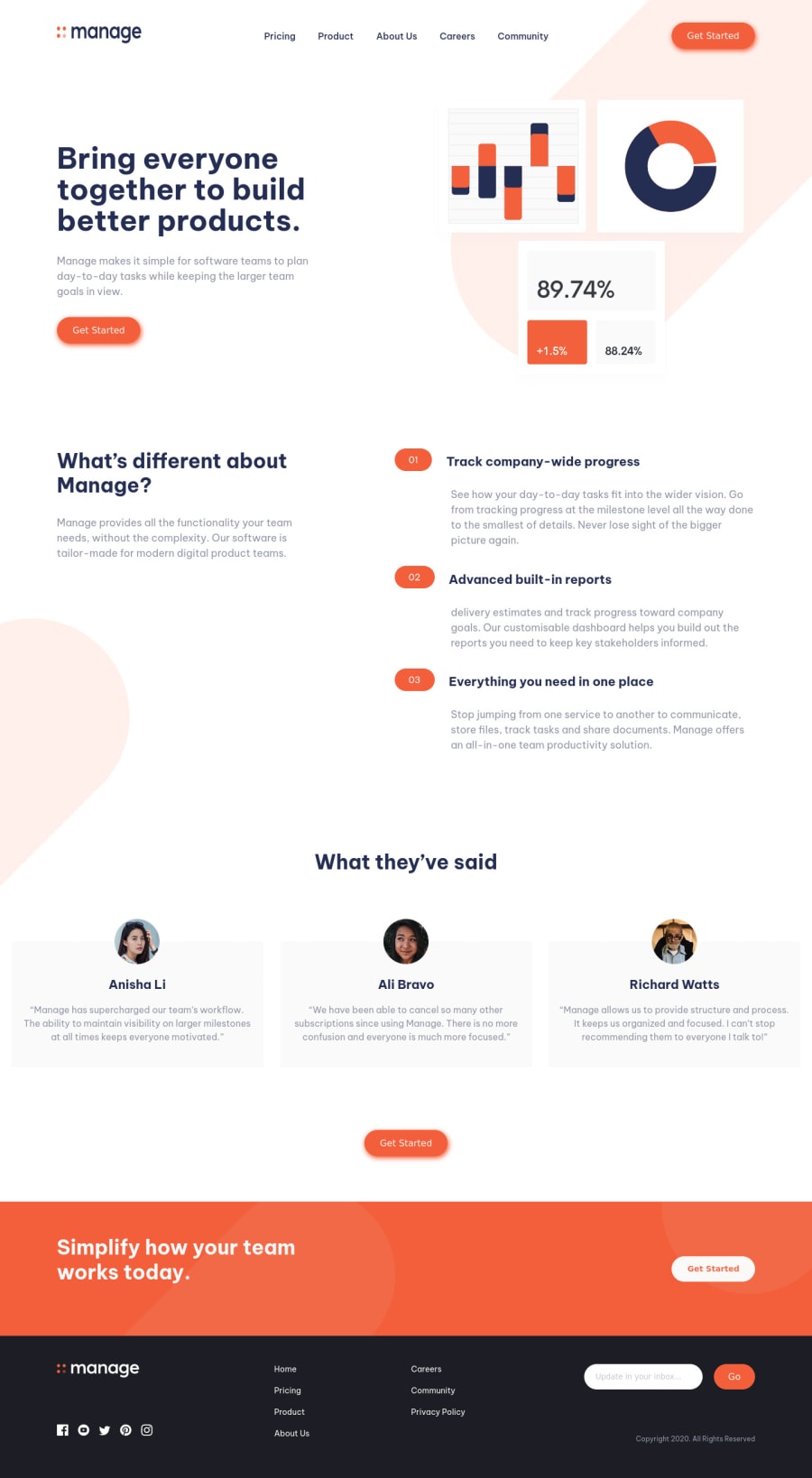
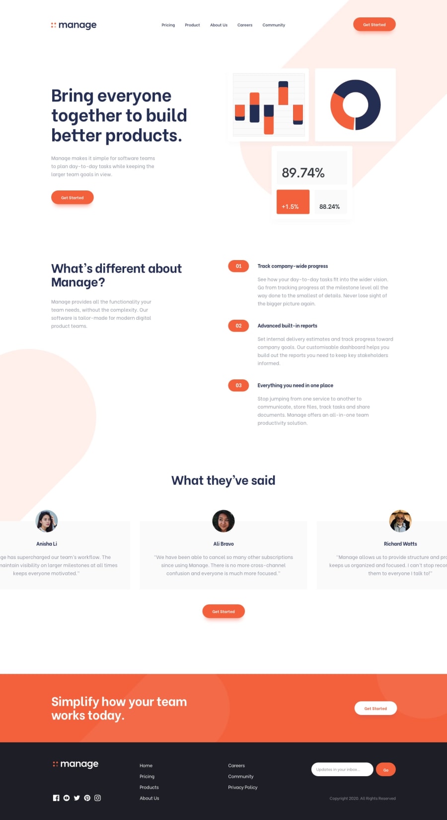
Design comparison
SolutionDesign
Community feedback
- @grace-snowPosted almost 2 years ago
Hi
This looks fabulous but immediate problems become apparent once I look at the code...
- Alt descriptions must describe an image if it is valuable and that includes any text on that image. For example, the logo alt must say what the logo says. Alt is not code like a class name, it is a human readable description of what an image looks like
- Do not repeat nav markup twice. Have the correct markup once and change how it is displayed using css
- The nav toggle must be done with a button that is accessibly labelled and has an aria expanded attribute. This button must be inside the nav, directly before the list of links it is toggling
- The list of nav links should be in a list element
- Overlays should be done with pseudo elements. You should never have totally empty divs in html (expect maybe aria live regions that are due to be populated via js)
- Get started would navigate to another page so should be an anchor tag just like all the other nav links
- You must use a main elements. The sections can go inside that
- Not essential, but the content that is numbered 01 02 03 implies to me that should be in an ordered list
- Never skip heading levels. You have gone from a h2 to a h4. They must be in order
- Consider changing the testimonial markup to a figure with figcaption and blockquote
- It is a WCAG failure to auto animate the testimonials like this. It would be raised as a critical bug in any audit because users have no way to pause or stop the movement. Instead users should be able to swipe AND click/keyboard select the buttons to move between them.
- It is very well established that social icons are clickable links. That means you must use anchor tags that are properly labelled
- If using svgs inline like this, they need to be aria-hidden true and focusable false. (Label the link in a different way, not in the svg code)
- You are missing a nav element with list of links inside for the footer. Once you've added that you will need to label/accessibly name both navs on the page (ie label the header nav as "main" and footer nav as "footer")
- The email sign up is still a form even with only one input
- Inputs must always be labelled
- Not wrong, but you are using the old input type submit. This was from before the button element existed. Now you should be using the more recent element - the submit button
- Next time work mobile first
- You are heavily nesting CSS selectors, making this css highly specific and impossible to maintain or scale. Break this habit ASAP. Use single class selectors as much as possible
- Do not change html font size like this!! I can't stress this one enough. You are making the site inaccessible to millions by doing this. Leave the defaults alone. I'll be writing more about this on fedMentor.dev in the next couple of weeks
Marked as helpful2@Dhairyash-1Posted almost 2 years ago@grace-snow Thank you very much for your valuable feedback.
I will take care of all of these points in future and will refactor the present code according to your suggestions.
0
Please log in to post a comment
Log in with GitHubJoin our Discord community
Join thousands of Frontend Mentor community members taking the challenges, sharing resources, helping each other, and chatting about all things front-end!
Join our Discord
