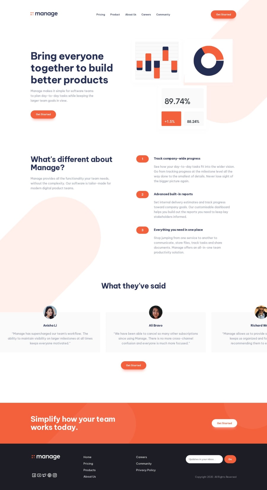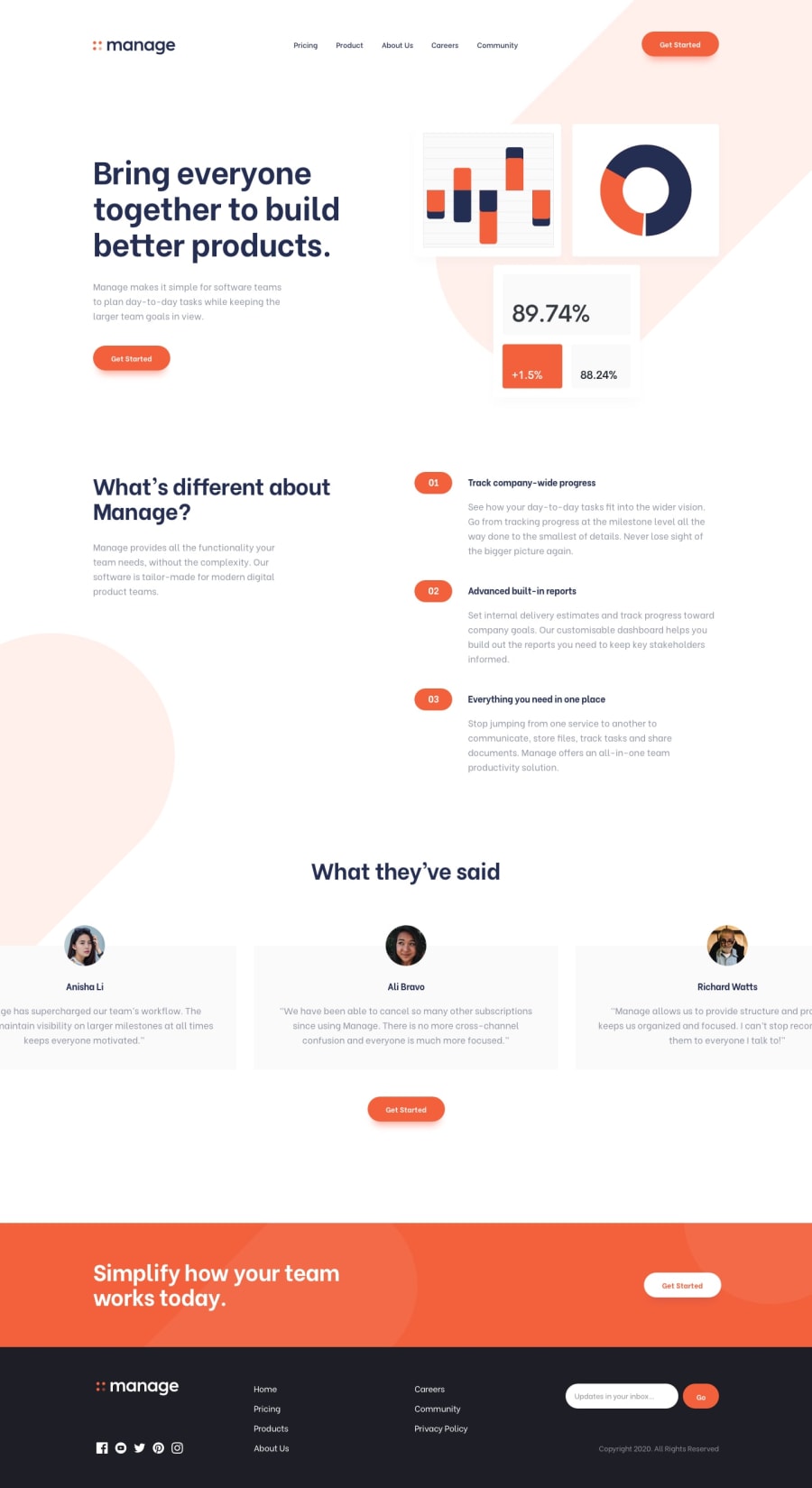
Design comparison
Solution retrospective
I will post the mobile version soon
Community feedback
- @SoniBasantPosted almost 2 years ago
Good work. 👏👏
I am making same. So I don't have suggestions, I have questions if you please answer. 🙏
-
How do you get white footer logo and also head logo for fevicon. These are not in my download file. 🙁
-
I was given svg images for social media icons so having difficulty in changing colour on hover. And you used i icons. 😇 That's clever. But will be guide me how to change colours on hover while using svg. Till now no success.
2@jmahamedPosted almost 2 years ago@SoniBasant I downloaded the logo from the figma files. And for the icons i used an icon library called remixicon. The only way to edit svg color would be to use svg markup in the html and copy and paste the content from the svg file then edit fill:currentColor, then select in the css but that’s so long winded that I just used an icon library. the head logo is just the cropped part of the manage logo. I saved it as a separate file once i cropped it
1@SoniBasantPosted almost 2 years ago@jmahamed thanks for the detailed reply. This is informative.
0 -
- @lack21Posted almost 2 years ago
Great work 👍, but I have some recommendations!
- Remove
width: 100%from thebody,bodyis a block level element which by default takes full space available, sowidth: 100%does nothing here! - Add
overflow-x: hiddento thebody, so all the unnecessary space on the right will disappear!
0@jmahamedPosted almost 2 years ago@lack21I only specify the width because of the flex. The parent element width has to be specified so that the child element can be centered
0 - Remove
Please log in to post a comment
Log in with GitHubJoin our Discord community
Join thousands of Frontend Mentor community members taking the challenges, sharing resources, helping each other, and chatting about all things front-end!
Join our Discord
