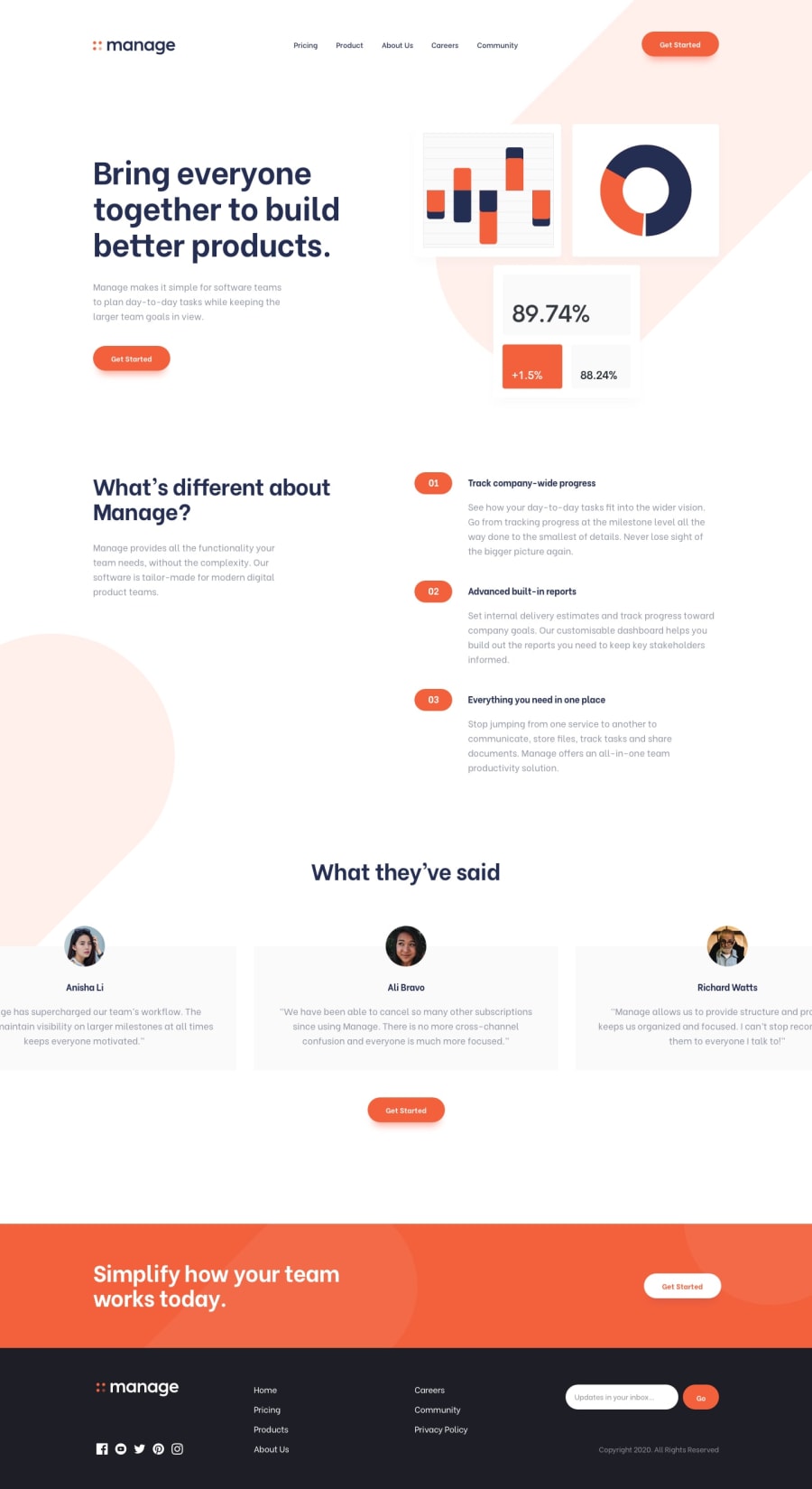
Design comparison
Community feedback
- @NoelaOstPosted about 2 years ago
Hi, love how your solution turned out. Great job!
I have some advice for you that could help fix some small things on your styling.
On your background you an easily add another bg-tablet.svg simply by adding another background-image and background position and separating it with comma. For example: background-position: 50px -350px, 300px 600px;
Another thing is light red background that appears on 3 sub headings on the smaller screens sizes. Notice how on the right side they go all the way to the end of the screen. There is actually very easy solution for that. You simply add box shadow in the same color as background, e.g. : box-shadow: 5em 0 0 var(--pale-red);
Good thing is, box shadow cannot overflow.
Happy coding:)
Marked as helpful0
Please log in to post a comment
Log in with GitHubJoin our Discord community
Join thousands of Frontend Mentor community members taking the challenges, sharing resources, helping each other, and chatting about all things front-end!
Join our Discord
