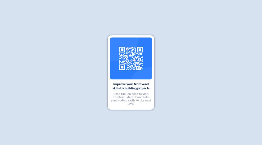
Design comparison
SolutionDesign
Community feedback
- @Agnik7Posted over 1 year ago
Hi, Congratulations on completing the challenge!!🎉🎉🎉🎉 You have done a wonderful job coding this QR component. However, I have some suggestions which I feel might be helpful for you.
- Always make sure to give an
alttext in theimgtag. Analtspecifies to the browser what to show if the browser is unable to display the image.<img id="image" src="images/image-qr-code.png" alt="QR Code Image"/> - Replace the
h4tag withh1tag. You don't need to use thebrtag. The width of the card will take care of that. - Instead of specifying the
widthof thedivwith class namecard, specify only themax-width, thereby making the card responsive. You don't need to defineheightof the card, because the card's height will be automatically taken care of by the text and margins and paddings inside the card. - The div with class name
flex-containeris actually unnecessary. Even if you remove it, only with some minor changes in the css file, you will get the same result.
If .flex-container is deleted, then add the following lines to the body selector body{ display: flex; justify-content: center; align-items: center; }- The div with class name
cardis also unnecessary. After deleting that div, copy its CSS styling and paste it inside the styling for themaintag and you'll get the same result.
Hope this comment helps you. Please feel free to correct me, if I have said anything incorrect.
Have a nice day!!
Marked as helpful1@kxtaraPosted over 1 year ago@Agnik7 Hi! Thank you so much for the feedback! I'm always looking to get some outside perspectives on my projects, and this was really helpful.
1 - Always make sure to give an
Please log in to post a comment
Log in with GitHubJoin our Discord community
Join thousands of Frontend Mentor community members taking the challenges, sharing resources, helping each other, and chatting about all things front-end!
Join our Discord
