Not Found
Not Found
Not Found
Not Found
Not Found
Not Found
Not Found
Not Found
Not Found
Not Found
Not Found
Not Found
Not Found
Not Found
Not Found
Not Found
Not Found
Not Found
Not Found
Not Found

Submitted

Making QR Code using HTML and CSS

@SerPet-eng

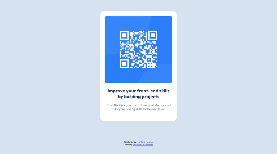
Desktop design screenshot for the QR code component coding challenge

This is a solution for...

  • HTML
  • CSS
1newbie
View challenge

Design comparison


SolutionDesign

Solution retrospective


Questions

1.) What did you find difficult while building the project?

  • Answer: Well, finding the right size for the margin and font-style. I'm not worried about the padding and border, only those two that give me some trouble.

2.) Which areas of your code are you unsure of?

  • Answer:
@media only screen and (min-width: 275px) {
  .app {
    margin: 1em;
  }
}

@media only screen and (min-width: 465px) {
  .app {
    margin: 2em;
  }
}

@media only screen and (min-width: 545px) {
  .app {
    margin: 2.5em;
  }
}

@media only screen and (min-width: 625px) {
  .app {
    margin: 20%;
  }

  .app-title {
    font-size: 4vw;
  }

  .app-paragraph {
    font-size: 3vw;
  }
}

@media only screen and (min-width: 1100px) {
  .app {
    margin: 37%;
  }

  .app-title {
    font-size: 1.8vw;
  }

  .app-paragraph {
    font-size: 1.3vw;
  }
}

@media only screen and (min-width: 1440px) {
  .app {
    margin: 37%;
  }

  .app-title {
    font-size: 1.8vw;
  }

  .app-paragraph {
    font-size: 1.3vw;
  }
}

I find this code of mine redundant but I'm not quite sure if there is another way of doing this kind of stuff. This just came out of mind and wing it. It works! but I had a feeling that there is another way of doing this.

3.) Do you have any questions about best practices?

  • Answer: Is there a better way to resize margins, font-size, and using media queries? I get its purpose but is there a better way to do those? Any answer or guidance/criticize, I will gladly accept.

Community feedback

@DigitaleWeltLibrary

Posted

Hello, I think you're making life too difficult.

Here's what you need to delete: (You don't need a @media query)

@media only screen and (min-width: 275px)
@media only screen and (min-width: 465px)
@media only screen and (min-width: 545px)
@media only screen and (min-width: 625px)
@media only screen and (min-width: 1100px) 
@media only screen and (min-width: 1440px)

Instead, we'll use Grid to center the card:

.app{
    display: grid;
    place-items: center;
    min-height: 100dvh;
}

Now let's give our map a max-width and margin when it comes to mobile devices (so it will be responsive):

.app-box{
    max-width: 350px;
    margin: 1rem;
}
  • We don't need to size the headline.
  • The paragraf we can give a size of font-size: 1rem;

Happy coding 😁

Marked as helpful

2

@coppinger

Posted

@DigitaleWeltLibrary excellent reply!

Another option would be to use flex to center the card:

.app {
    display:flex;
    justify-items:center;
    align-items:center;
}

You can learn more about flexbox here:

https://css-tricks.com/snippets/css/a-guide-to-flexbox/

Great work on this challenge, and as Raphael said, happy coding!

2

@DigitaleWeltLibrary

Posted

@coppinger Thank you! Right, it works whit flex, too. but for flex you need more lines of CSS. 😅

0

@SerPet-eng

Posted

Thank you Raphael Bröderbauer! for the feedback. It makes my code more refine and understandable. I really appreciate your comment about my code and very first Frontend Mentor Challenge.

I'm looking forward for your feedback to my next Frontend Mentor Challenge. After I updated the code, I'll do another challenge.

0

@DigitaleWeltLibrary

Posted

@SerPet-eng Thanks, glad to hear that I was able to help 😉

0

@coppinger

Posted

@DigitaleWeltLibrary more or less lines of CSS (or code in general) does not always constitute better code

In this case, I would argue that as we're only dealing with one dimension of placement, flex would be more appropriate, but that's probably largely personal preference.

I like to think as flex as being for col/row layouts (one dimension), and grid for layouts that require placement across two dimensions.

0

Please log in to post a comment

Log in with GitHub
Discord logo

Join our Discord community

Join thousands of Frontend Mentor community members taking the challenges, sharing resources, helping each other, and chatting about all things front-end!

Join our Discord