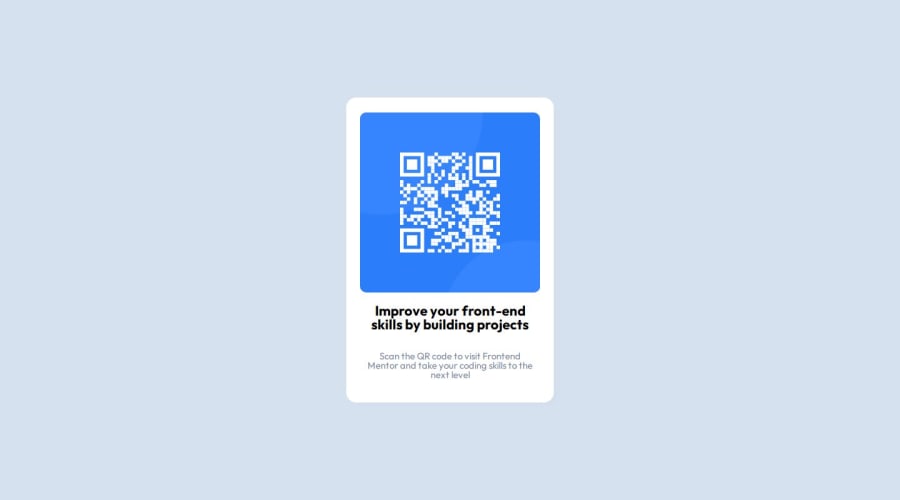
Design comparison
Solution retrospective
that I was able to make this on my own, with a little help. study more the tools to be able to finish faster next time.
What challenges did you encounter, and how did you overcome them?the image, i thought that the qr code and the blue backgroud were suposed to be separate images, so i spent a good time trying to overlay them. Then I just used the image that had them together.
What specific areas of your project would you like help with?If the qr code and the blue background should be acturaly separate or if they should actualy be together in one image.
Community feedback
- @Endy1381Posted 12 months ago
hey there you nailed it! this is almost as the base design. about your question on the QR code, i think you meant if the blue and the QR is separate. in this case it is. also if you can change the H1 color to a dark blue that will make it good like the design.
1
Please log in to post a comment
Log in with GitHubJoin our Discord community
Join thousands of Frontend Mentor community members taking the challenges, sharing resources, helping each other, and chatting about all things front-end!
Join our Discord
