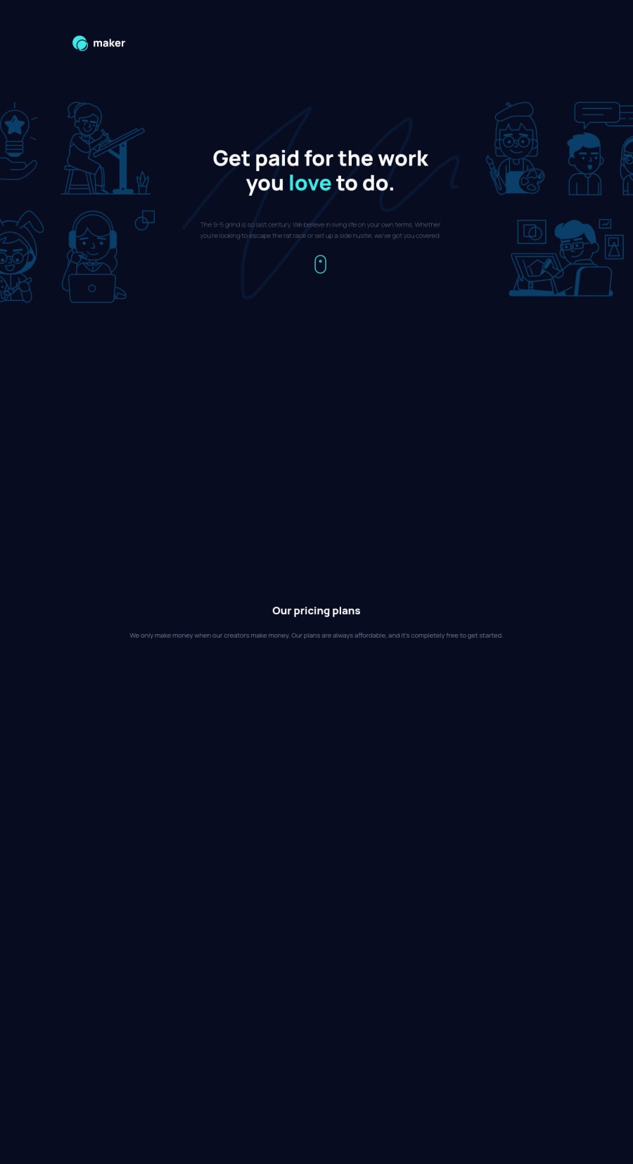
maker-prelaunch-landing-page with vanilla JS animated with AOS
Design comparison
Solution retrospective
Fist implementation of stying with BEM. I appreciate your advice about the usage of BEM. Any other advice is also appreciated!
Community feedback
- @ApplePieGiraffePosted over 3 years ago
Hello there, Josuke! π
Good work on this challenge! π The on-scroll animations in your solution are very nice! π
I'd like to suggest,
- Adding a max-width to a few of the sections of the page so that they maintain their size when the screen width grows larger (and don't start to seem stretched or anything).
- Perhaps making the heading of the hero section of the page a tad bit bigger in the tablet/mobile layout (it seems a little small).
Keep coding (and happy coding, too)! π
1@josuke0227Posted over 3 years ago@ApplePieGiraffe Hello, APG! (^Ο^) Thank you for your advice!! I browse my site and found out it gets uglier as the size of the display gets bigger, decided to add max-width to body tag. I also got the one of the best practices - make sure to try all the sizes of the display I can emulate on chrome dev tool before launch!
About the second suggestion, actually I didn't realise that the header of the hero section is smaller than what is written in figma. It was because of the conflict of stylesheets between mine one and normalize.css!
Happy cording too! π
1 - @pikapikamartPosted over 3 years ago
Yours is really good and those observers , are those observers? I don't really use react but I use other api for that one. For the BEM, well we use BEM to be reusable right, but the thing is that, we just don't use them because they are easy to use since we can just declare one block then just append their child names right. We use them so that we avoid multiple stylings. We should first look at the layout then take note of different sections and look for the similarities of it, that similarity will be our block in BEM naming. Then we'll just add the states, in the manner of
--
syntax. One best example of this is using a block of flexbox, since you can just manipulate any layout just using that and just adding different states likeflex--column
which will beflex-direction
something like that. Well it just takes time to properly grasp BEM principles but that is the gist of it. Really, your work is good^1@josuke0227Posted over 3 years ago@pikamart Thank you so much for your comment! I'm sorry but I'm not quite sure about observers... (^o^;; Also, I appreciate your descriptive advice to BEM convention. I built this page with bottom-up approach - implement small parts -> layouts. I was refactoring my code and found out some repetitive stying as you mentioned ... I leaned that I need to pay much attention to layout and the structure to master BEM.
0@pikapikamartPosted over 3 years ago@josuke0227 Your welcome on that one, the observers, they are just like on-scroll with some properties :>
1@josuke0227Posted over 3 years ago@pikamart Thank you for your reply! :)
I used scroll-animation library called AOS. You can use it just put a few tags in your HTML for initialising, then set attributes in elements you want to add motions. It's super easy to use, so give it a shot if you like it !π https://michalsnik.github.io/aos/
Happy coding!
1@pikapikamartPosted over 3 years ago@josuke0227 Will be trying that in future challenges to add some you know, styles ^
1
Please log in to post a comment
Log in with GitHubJoin our Discord community
Join thousands of Frontend Mentor community members taking the challenges, sharing resources, helping each other, and chatting about all things front-end!
Join our Discord