

Design comparison

Solution retrospective
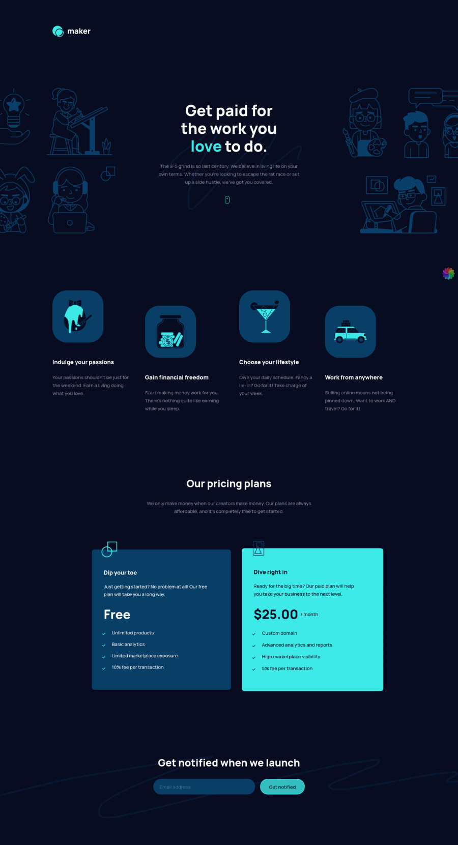
Hi! I just completed this challenge, any feedback is welcome! Thanks 😊
Please log in to post a comment
Log in with GitHubCommunity feedback
- @Finney06
Hello there 👋. Good job on completing the challenge !
Here are some suggestions regarding your code that may be of interest to you.
HTML 🏷️:
To clear the Accessibility report:
-
Wrap the page's whole main content in the
<main>tag. -
Always avoid skipping heading levels; Starting with
<h1>and working your way down the heading levels (<h2>,<h3>, etc.) helps ensure that your document has a clear and consistent hierarchy. -
Use HTML5 semantic elements such as
<header>,<nav>,<main>,<aside>, and<footer>to define these sections.
Here is a web accessibility evaluation tool📕 to check your webpage for any remaining errors or warnings related to landmarks.
I hope you find it helpful!😏 Above all, the solution you submitted is 👌. 🎉Happy coding!
Marked as helpful -
- P@visualdenniss
Great job in completing the challenge successfully! Your solution looks great overall, the design implementation is simple neat. Both mobile and desktop view respond well to resizing.
One little thing to add would be to add some hover states and cursor:pointer; for the button. You can change its background color on hover for example and add some transition like transition: background-color .4s ease; for a smooth transition.
If this was helpful, feel free to mark it as helpful! Good luck on upcoming projects!
Marked as helpful


Join our Discord community
Join thousands of Frontend Mentor community members taking the challenges, sharing resources, helping each other, and chatting about all things front-end!
Join our Discord