

Design comparison

Community feedback
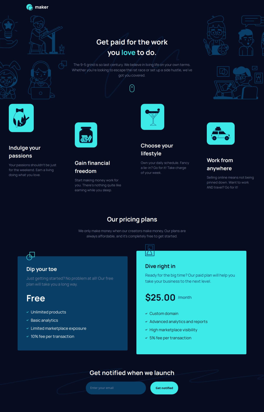
- P@Shaimaa01Posted 3 months ago
In the second section (.main__grid-images-section__grid-images-container__grid-image-container), I noticed a few areas that could be improved to better align with the original design:
Background Color: The original design uses #093F68, but the current implementation has #3EE9E5. It would be great to match the original background color for consistency. Border Radius: The border radius currently seems too small. Increasing it to 45px would enhance the design and add a smoother, more modern look.
For the desktop view: The width of each feature is too small, causing the headings (e.g., Indulge your passions) to wrap onto a second line. Adjusting the width to prevent wrapping would improve readability and match the design.
In the mobile view: The background color for each feature has been removed, which is inconsistent with the design. It might be better to restore the background color to match the original layout.
Marked as helpful1

Please log in to post a comment
Log in with GitHubJoin our Discord community
Join thousands of Frontend Mentor community members taking the challenges, sharing resources, helping each other, and chatting about all things front-end!
Join our Discord