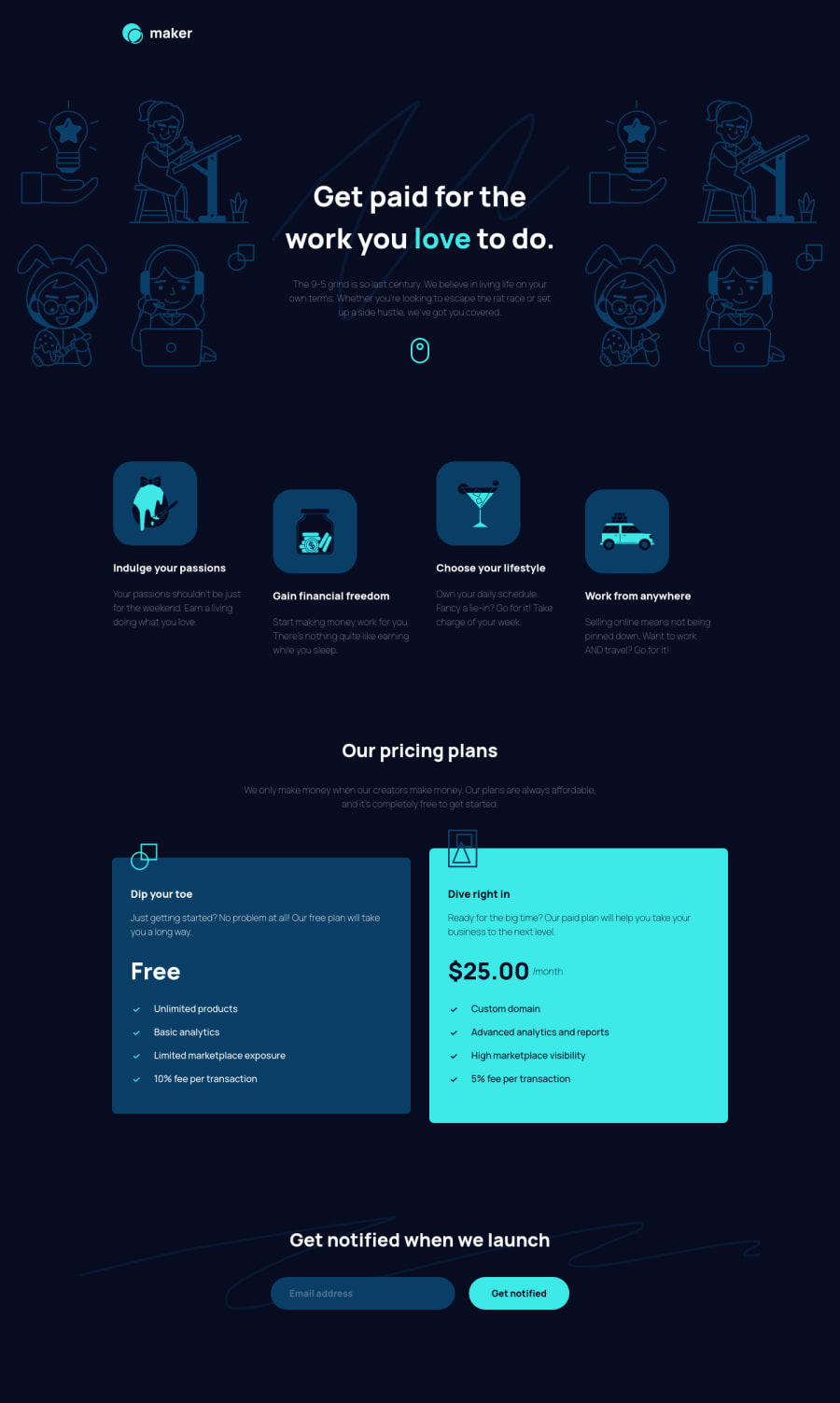
Maker Landing Page w/ Animate.css Form Validation π
Design comparison
Solution retrospective
Any pointers much appreciated!! π
Community feedback
- @pikapikamartPosted about 3 years ago
Hey, great work on this one. I think this is my first time to see a solution on this challenge, design looks great though. Desktop layout is great, it is responsive and the mobile state looks really great as well.
Some suggestions would be:
- I noticed that the
font-weight
of the text are super thin, instead of200
maybe go with the normal of400
since it makes it hard to read the text since it is thin. - Lose the word
logo
in the website-logo, use only the website name's as thealt
value. - Hero-section's background-image should be hidden. Decorative image must be hidden at all times for screen-reader users by using
alt=""
and extraaria-hidden="true"
attribute on theimg
tag. - Also when using
alt
attribute, avoid using words that relates to "graphic" such as " illustration" and others. Animg
is already an image/graphic so no need to describe it as one. - Those 4 icons are just decoration as well so it is better to hide them using the method above.
- Good choice of article for the pricing!
- Though I wouldn't use a heading tag on the
dip your toe
ordive right
in because it doesn't really convey any information on what the section would contain. Because if you read it right, it doesn't really connect to anything. Instead I would make thefree
and the25$/month
as a heading tag since they describe what is the section is all about. But maybe adding like aplan
word likefree plan
but theplan
word is using a screen-reader class. Same with the 25$. - Right now, there is no clear indication if the form submitted is a success or has an error. If the
input
submitted is wrong, add anaria-invalid
on theinput
. - The
input
as well needs to have eitheraria-label
or screen-reader onlylabel
labeling what does theinput
needs, henceenter email
something like that. - Adding an
aria-live
as well that will announce if the form submitted is a success or not. This way, users will be informed right away what happened. Have a look at this simple accessible form snippet of mine though my live-region element only state one phrase, you can alter that to what ever error your user had made.
Aside from those, great job again on this one.
Marked as helpful1@fraserwatPosted about 3 years ago@pikamart thanks, this is so helpful!! Fixing this (and googling a bunch of stuff) has actually cleared up a lot of things I wasn't too sure about. Have updated my solution, I think I've got it right? As there's only one input in my form I just hardcoded the aria-describedby attribute into the HTML.
What do you usually use to check accessibility on screen readers? Do you use one you'd recommend for making sure all this stuff checks out?
0@pikapikamartPosted about 3 years ago@fraserwat Hey, great that you found it useful.
Well there isn't really that checks all accessibility feature on a site, knowing them as you just go along doing frontend and loots of googling using "accessible" word like "accessible testimonials", something like those.
For screen-reader, on my phone I use the talkback, for every phone there is a built-in one, on mine it is talkback and on my laptop, I use nvda screen-reader. Though I don't really use nvda or talkback to check for every site review, I use them when I am not certain that a section or layout is not properly using something
0 - I noticed that the
Please log in to post a comment
Log in with GitHubJoin our Discord community
Join thousands of Frontend Mentor community members taking the challenges, sharing resources, helping each other, and chatting about all things front-end!
Join our Discord