Design comparison
SolutionDesign
Solution retrospective
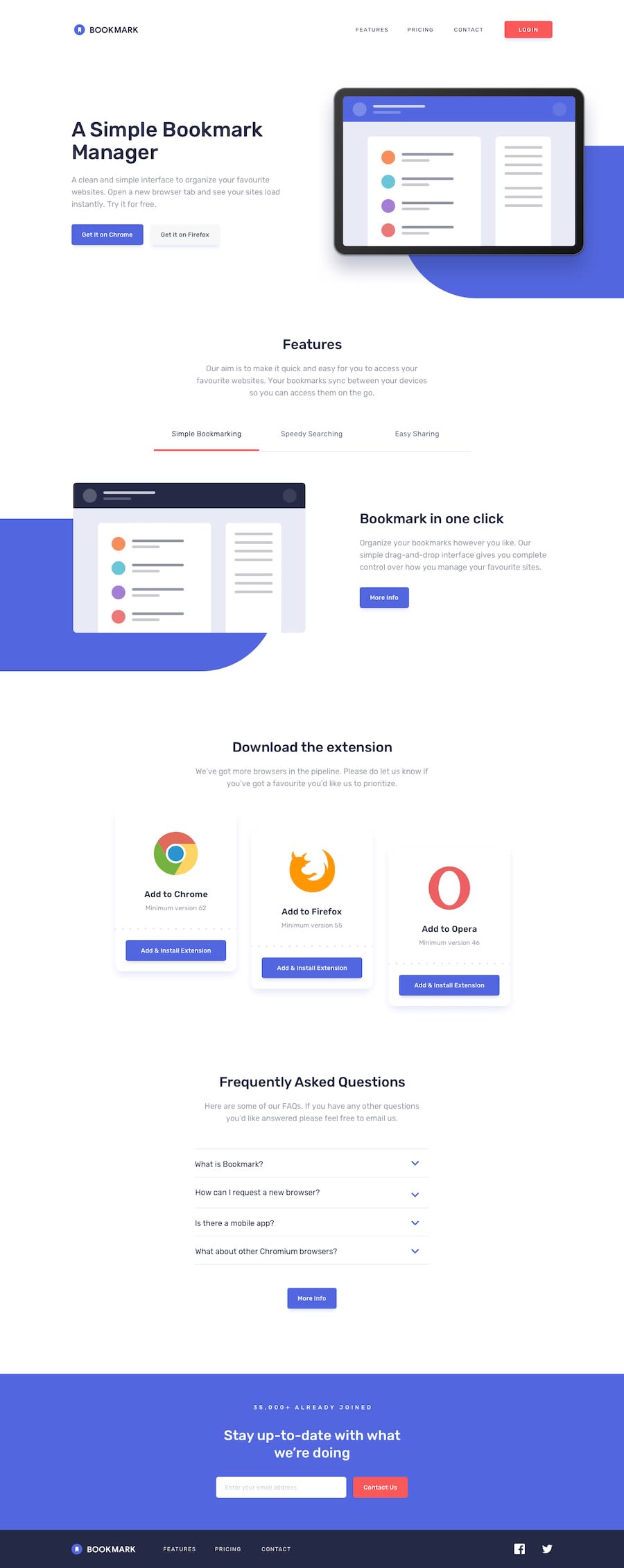
The screenshot is missing half the footer element... don't know why this happens. Also I find it very hard to measure the positioning and size of the elements with naked eye.
Learned some nice tricks and hacks with this project - the mobile menu design, the hover-effect of the features tabs, the fold-out faqs... really enjoyed this challenge!
Community feedback
Please log in to post a comment
Log in with GitHubJoin our Discord community
Join thousands of Frontend Mentor community members taking the challenges, sharing resources, helping each other, and chatting about all things front-end!
Join our Discord
