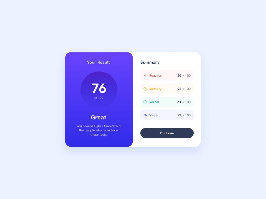
Design comparison
SolutionDesign
Solution retrospective
What challenges did you encounter, and how did you overcome them?
starting the project is one of the most challenging parts and i try to overcome it by trying, even if i feel overwhelmed and lost at first, my head clears out as i work on the project little by little!
What specific areas of your project would you like help with?i couldnt figure out how to stack '76 of 100' vertically. in the end i liked the side by side version, so i didn't bother with it... however, id love to know how i couldve done it
Community feedback
Please log in to post a comment
Log in with GitHubJoin our Discord community
Join thousands of Frontend Mentor community members taking the challenges, sharing resources, helping each other, and chatting about all things front-end!
Join our Discord
