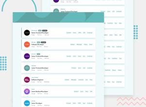
Design comparison
Solution retrospective
I don't know React or other JS framework so I made this with vanilla JS.
Any kind of feedback is highly appreciated!
Community feedback
- @Mahesh-yadavPosted over 4 years ago
Hi
Great solution. I have few suggestions:
-
You need to hide
searchbar, when there are no filters to search. -
On mobile, the company logo should be moved up. You can use following:
position: absolute; top: // this should be equal to half the width of logo with a minus sign so that half of the image is outside the top edge of card left: // equal to the left padding of the card -
You are using desktop first approach which in my opinion not correct. In desktop first approach, the browser does following on a mobile: It first applies all desktop styles and then @media rule style i.e first those for max-width: 1200px, then max-width: 900px and finally max-width: 600px (assuming these are your breakpoints). This is not efficient on mobile with lower computing power (consider all mobiles not just high-end devices). So use Mobile First approach
-
Finally, learn any frontend framework vue or react etc. These are very efficient and developer friendly when generating DOM elements from data such as an array of jobs and manipulating the dom when data changes.
2@ovidiuantonioPosted over 4 years ago@Mahesh-yadav Thank you very much for your feedback! I will consider these changes and I will definitely learn a framework in the near future!
0 -
Please log in to post a comment
Log in with GitHubJoin our Discord community
Join thousands of Frontend Mentor community members taking the challenges, sharing resources, helping each other, and chatting about all things front-end!
Join our Discord
