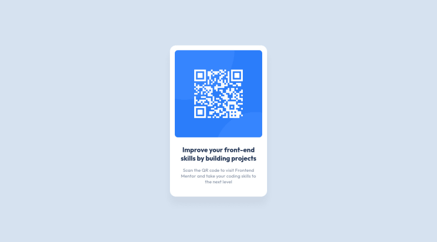
Design comparison
Solution retrospective
This is my first submission to frontend mentor, I used SCSS and tried BEM Notation, I would appreciate any feedback, thank you in advance!
Community feedback
- @JulioCinquinaPosted over 2 years ago
Welcome to Frontend Mentor!
You've pretty much nailed it; your solution looks very close to the design. Congratulations!
Here are some accessibility-related suggestions:
<img>elements should almost always have an alt text, except for those that are purely decorative or described by nearby text;- It's a good practice not to skip heading levels, that is, only use
<h5>when you have already used<h1>,<h2>, and so on.
Also, take a look at Frontend Mentor's report for your solution. I hope this helps!
Marked as helpful0@s0alkenPosted over 2 years ago@JulioCinquina Hey! thanks for your feedback!, I updated my solution
0
Please log in to post a comment
Log in with GitHubJoin our Discord community
Join thousands of Frontend Mentor community members taking the challenges, sharing resources, helping each other, and chatting about all things front-end!
Join our Discord
