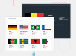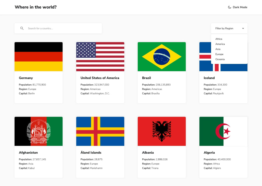
Design comparison
Community feedback
- @RagudosPosted about 1 year ago
Hello, CJ. Great Job! I love the SVG animation you did on the icons! A few recommendations after seeing the webpage:
- Add the currently chosen filter in the button that toggles the filter dropdown for user experience.
- The search functionality feels clunky, and I can see that the URL query for search params do not have anything.
Some improvements for the code:
-
For example, the code in Home.tsx has a useEffect for fetching data. I recommend moving the function outside the useEffect since when it is inside, then that means it is recreated everytime the useEffect is ran. After moving it outside, I recommend wrapping it inside a useCallback and add the "region" state as a dependecy to tell React that we only need to recreate the function when the state "region" changes. May I know why is it needed to set the countries state to an empty array when we get an error? Additionally, can't we just do that inside the try catch block to avoid an unnecessary rerender?
-
Since you are not sending out any request to a server when we type in the searchbar, try to attach an event.preventDefault() on the form
Overall, great job!
Marked as helpful1@CodeChdPosted about 1 year ago@Ragudos Thanks for the feedback just fixed the issue! . Regarding the search filter, the 'Forms' component is a custom component that I named as such. Since I only have an 'onChange' event for the search filter, I didn't include 'event.preventDefault()'
0
Please log in to post a comment
Log in with GitHubJoin our Discord community
Join thousands of Frontend Mentor community members taking the challenges, sharing resources, helping each other, and chatting about all things front-end!
Join our Discord
