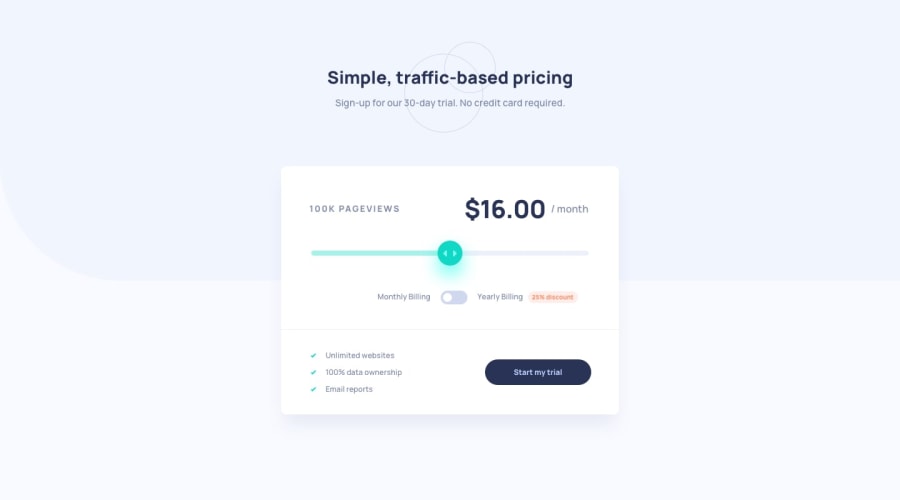
Design comparison
Solution retrospective
I'm looking for feedback on the JS logic and what I could improve.
Thanks,
Community feedback
- @Moyo75Posted over 3 years ago
On mobile:
- The elements in
<div class="card__toogle-button"></div>should be displayed in one line. This may be partly due to the nesting in its last p tag and also to the padding you gave to<div class=''card-up"></div>. So you might want to fix/adjust those.
General:
-
The elements in
<div class="card__toogle-button"></div>should be more aligned to the right. They seem somewhat centered. -
The paragraph texts in the header are not visible and the header is too close to the component. I think it's due to the
transformproperty in<section class="card"></section>, so removing that might help. -
You might want to include a reference to yourself as the developer and also to FEM.
Hopefully this helps to get your app look and behave more as described in the project requirements.
1 - The elements in
- @tesla-ambassadorPosted over 3 years ago
Aside the HTML and accessibility issues, I think this is some pretty great work.. though the card component is a little too wide but I know that is a quick fix. Happy coding
0
Please log in to post a comment
Log in with GitHubJoin our Discord community
Join thousands of Frontend Mentor community members taking the challenges, sharing resources, helping each other, and chatting about all things front-end!
Join our Discord
