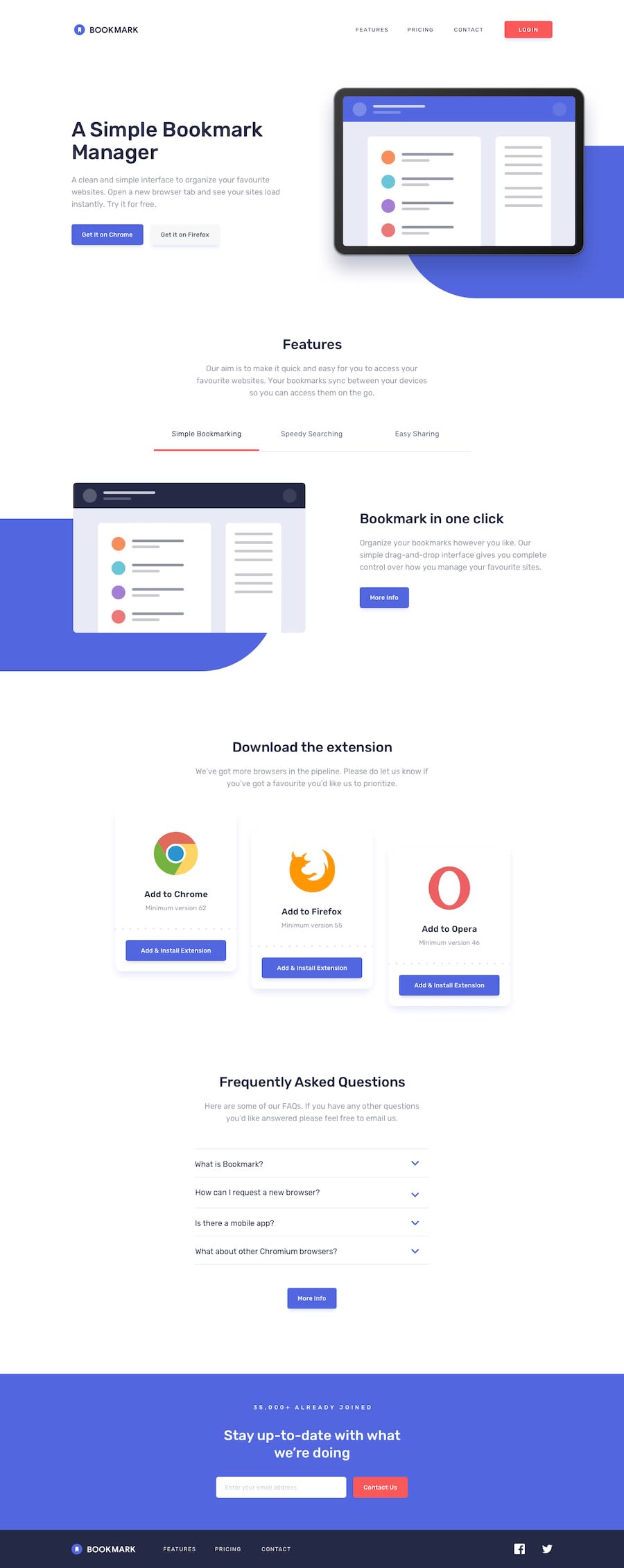
Made with html , css , javascript , jquery , bootstrap
Design comparison
Community feedback
- @dimolf345Posted about 3 years ago
Hello! Nice project! I've completed it also recently! I personally like the pulsing effect on the button on the landing section.
By the way, I noticed that your bookmark logo in the footer is not as in the design. I also had the same problem with the different color from the header.
I solved the problem pasting directly the SVG into the HTML file and giving the element inside the SVG a class. With this solution you can customize the fill property in CSS. See this article from CSS tricks for further info: https://css-tricks.com/using-svg/
You should also think to increase the margin between the section to make your page look as close as possible to the provided design. Nice Work!
Marked as helpful1@nobel10122025Posted about 3 years ago@dimolf345 thanks a lot for your review , definitely i will try to implement in SVG format and the link is very useful. thanks again.
0
Please log in to post a comment
Log in with GitHubJoin our Discord community
Join thousands of Frontend Mentor community members taking the challenges, sharing resources, helping each other, and chatting about all things front-end!
Join our Discord
