Submitted over 1 year ago
Made using TailwindCSS
#tailwind-css#accessibility
@comradeintense
Design comparison
SolutionDesign
Solution retrospective
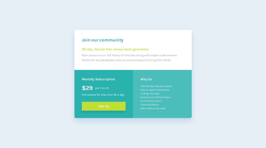
Tried to make it as close as possible to original design. I didn't have the Figma file, so this was painful, I do not recommend. Chasing pixel perfection is a sure way towards a life in the asylum.
Initially when I looked at the project I was thinking of using flex on the bottom two columns and make them equal size but the word "Grid" was in the challenge name, so I took it as a hint and tried to do it with grid even though it's not my preferred choice, but it was quite easy.
Any feedback is gladly appreciated!
Community feedback
Please log in to post a comment
Log in with GitHubJoin our Discord community
Join thousands of Frontend Mentor community members taking the challenges, sharing resources, helping each other, and chatting about all things front-end!
Join our Discord
