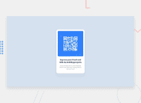
Design comparison
Solution retrospective
Feedback welcomed
Community feedback
- @IshmaelsealeyPosted over 1 year ago
Hi There
This is a great solution. Near completely identical to the original design!
The one thing that is deviant from the design is the line height of the heading and paragraph. I suggest you make the line height smaller.
Additionally, for the purpose of accessibility, you should switch the heading from an
<h2>tag to an<h1>tag.I hope you find my suggestion helpful
Marked as helpful0@comradeintensePosted over 1 year ago@Ishmaelsealey Thank you for the feedback ! I went with a H2 for the reasoning that if this was in a bigger website, the H1 would be somewhere else, but strictly looking at this, h1 would make sense of course.
Yeah totally messed up the line height!
1
Please log in to post a comment
Log in with GitHubJoin our Discord community
Join thousands of Frontend Mentor community members taking the challenges, sharing resources, helping each other, and chatting about all things front-end!
Join our Discord

