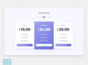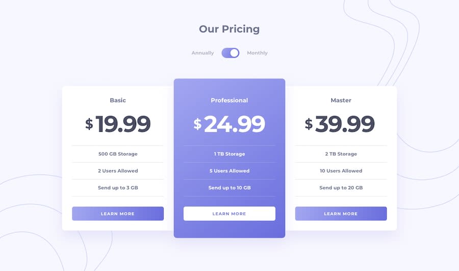
Submitted over 4 years ago
Made using HTML , CSS(flexbox) and vanilla JS
@HayBeeCoder
Design comparison
SolutionDesign
Solution retrospective
Don't think I have any issues but your reviews and feedbacks are surely welcomed.Thanks in advance
Community feedback
- @shashiloPosted over 4 years ago
This is a good solutions, but I do see some issues. First, there's some design issues with font color, letter spacing on the button, border color, box-shadows etc. Semantically, I would use
h1, h2, h3for your headings. Instead of creating 2 spans for the pricing content, just use 1 for the dollar symbol. Then, you can make the p tag have the pricing styles. Less DOM elements will make your code cleaner.0
Please log in to post a comment
Log in with GitHubJoin our Discord community
Join thousands of Frontend Mentor community members taking the challenges, sharing resources, helping each other, and chatting about all things front-end!
Join our Discord
