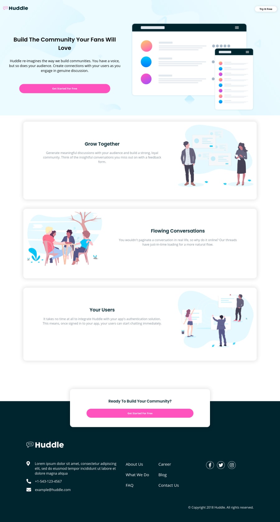
Submitted about 3 years ago
Made using HTML, CSS basics, Flexbox, Grid and mobile-first design
@R0b3rtG
Design comparison
SolutionDesign
Solution retrospective
Hello! :)
Please Leave Some Feedback!
I would really appreciate it!
;)
Community feedback
- @ChamuMutezvaPosted about 3 years ago
Congrats for taking this challenge.
- managed to check it on mobile, and I can say you did a great job.
- for the links, you can improve the accessibility by using an
ul
. Screen readers generally announce the length of the screen and the current position when tabbing - which is vital to assistive technology users. - for the social links provide extra information using aria-label since they is no text in the links except the icons - assistive technology users will not know the purpose of the link at present
Marked as helpful1@R0b3rtGPosted about 3 years ago@ChamuMutezva I kept getting these kind of "assistive technology users" feedback from many people. I guess it is a pretty big problem. I didn't really understand what it is about at first, but now I kind of do. I'll look into it later this day. It seems to be important so I'll try to find some solutions. Thank you very much for your feedback! Take care!
0
Please log in to post a comment
Log in with GitHubJoin our Discord community
Join thousands of Frontend Mentor community members taking the challenges, sharing resources, helping each other, and chatting about all things front-end!
Join our Discord