Not Found
Not Found
Not Found
Not Found
Not Found
Not Found
Not Found
Not Found
Not Found
Not Found
Not Found
Not Found
Not Found
Not Found
Not Found
Not Found
Not Found
Not Found
Not Found
Not Found

Submitted

made responsive nav bar with javascript.

Austin 330

@waustin45

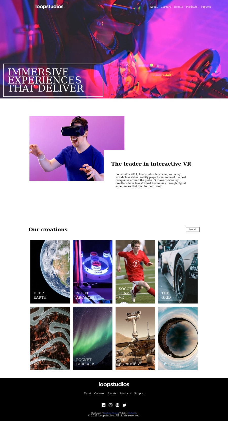
Desktop design screenshot for the Loopstudios landing page coding challenge

This is a solution for...

  • HTML
  • CSS
  • JS
2junior
View challenge

Design comparison


SolutionDesign

Solution retrospective


I enjoyed this project. My only problem is trying to get the content to be centered on the mobile version. It all clings to the left side despite being centered by flexbox. I think i removed all of the padding and margin from the body. How do I go about fixing my centering issue? Any suggestions would be appreciated!

Community feedback

David 8,000

@DavidMorgade

Posted

Hello man and congrats on finishing the challenge, here are a few tips and approach that maybe can help you for future projects!

1 - First of all I have checked your project and it seems to broke from 440 px to 1440px, try reseting all margins and paddings at lowers sizes, for example all the margins from your header, main and footer, they are causing your layout to overlay because you are using 100% widths + margins and this means that they will get out of the screen, also consider using mediaquery with max-width until 768px instead of 440px, and create a new breakpoint until 1440px for tablet sizes (from 768px to 1440px).

2 - Consider using relative units such as rem and % instead of pixels, most of the time using pixels can cause buggy behaviours on diferent screen viewports.

3 - Also consider using a main tag instead of applying all styles directly on the body, you can wrap everything in your main tag an leave the footer alone.

4 - Last but not less important advice is to use the mobile first approach!, start building your apps from mobiles sizes and then adapt them to desktop sizes, trust me it will be easier when you get used to it, also consider using min-width on media querys instead of max-width, this is a personal preference, but most developers do it this way!

Hope my feedback helped you for your next projects!

Marked as helpful

2

Austin 330

@waustin45

Posted

@DavidMorgade I appreciate the feedback! I will take this advice to my next project!

1

Please log in to post a comment

Log in with GitHub
Discord logo

Join our Discord community

Join thousands of Frontend Mentor community members taking the challenges, sharing resources, helping each other, and chatting about all things front-end!

Join our Discord