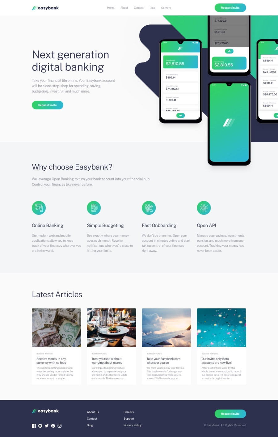
Design comparison
SolutionDesign
Solution retrospective
I'm not sure how to position images at the start of the main section - there was a lot of problems with overflowing, cutting the bottom-half though absolut positioning with bottom of 0, or playing with object-fit. It took a lot of time. Is there some good practice for this kind of layout?
Community feedback
Please log in to post a comment
Log in with GitHubJoin our Discord community
Join thousands of Frontend Mentor community members taking the challenges, sharing resources, helping each other, and chatting about all things front-end!
Join our Discord
