Design comparison
SolutionDesign
Solution retrospective
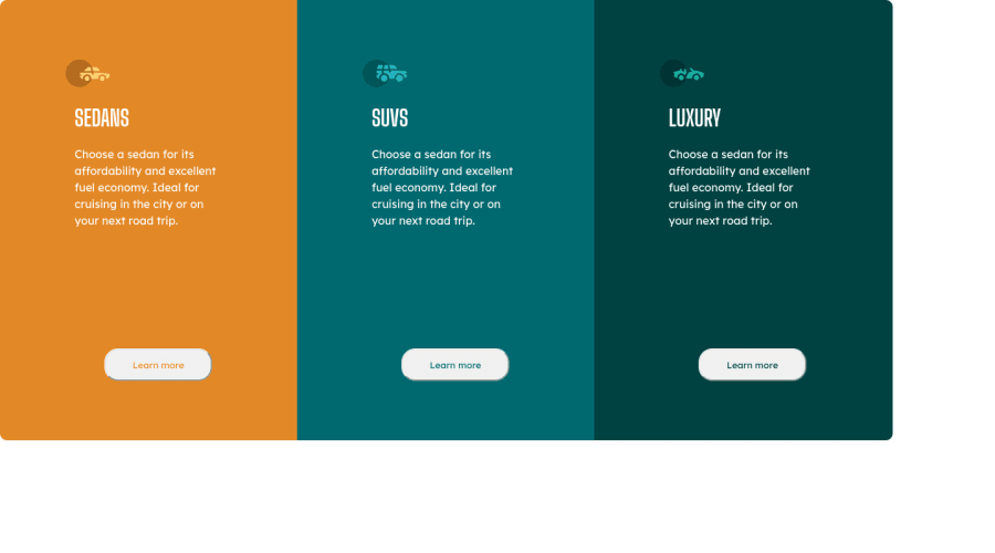
It looks really not bad in file on my PC, but after I uploaded it on GitHub my divs stretched and their height doubled. Also mobile version absolutely doesn`t work. I guess my mistakes are really stupid, so, please, tell me how it should work
Please log in to post a comment
Log in with GitHubCommunity feedback
No feedback yet. Be the first to give feedback on Andrii's solution.
Join our Discord community
Join thousands of Frontend Mentor community members taking the challenges, sharing resources, helping each other, and chatting about all things front-end!
Join our Discord
