Design comparison
SolutionDesign
Solution retrospective
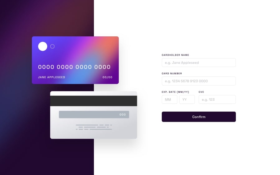
it was a really interesting project to work on, i learnt a lot of javascript along the way but i couldnt figure out how to space the numbers in the card after 4 characters and i couldnt figure out what the small circle was and how to make it look like that . As usual , i'm open to criticism and feedback , thank you.
Community feedback
Please log in to post a comment
Log in with GitHubJoin our Discord community
Join thousands of Frontend Mentor community members taking the challenges, sharing resources, helping each other, and chatting about all things front-end!
Join our Discord
