Design comparison
Solution retrospective
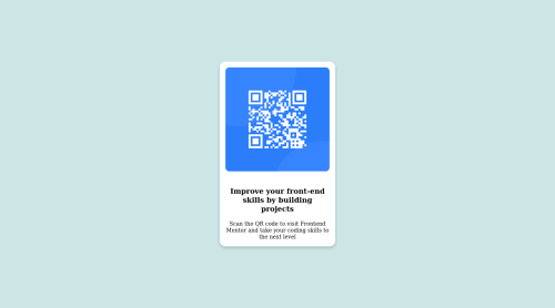
I kind of forced the image in position with padding but I'm kind of unsure if thats the correct way to do it. If there is a better way to center-align, Iwould like to know because at one point the card was half way leaving the screen.
Please log in to post a comment
Log in with GitHubCommunity feedback
- P@DarrickFauvel
Hi @bobo62234, 👋
Congratulations on your first solution! 🥳
It looks like your font face is not working properly. Try this in your stylesheet:
@import url('https://fonts.googleapis.com/css2?family=Outfit:wght@400;700&display=swap');
...and...
body { font-family: 'Outfit', sans-serif; }
I hope this is helpful. 😊
Marked as helpful - @DiegoTorresUSA
I´m noob in this theme, but I noticed that the background is a little different of the challenge.
Another thing is that the font-family is different , if you check the resources they gave you, there are the colors, the fonts, and the necessary that you must use in the challenge.
Keep learning!!!
Marked as helpful - @Akhlak-Hossain-Jim
Great work so far.
- instead of
<div class="card">
use<main class="card">
- it's not responsive now try doing that, and code not accessible.
try those fixes and mark the comment helpful if it is.
Thanks, Happy coding :)
Marked as helpful - instead of
Join our Discord community
Join thousands of Frontend Mentor community members taking the challenges, sharing resources, helping each other, and chatting about all things front-end!
Join our Discord