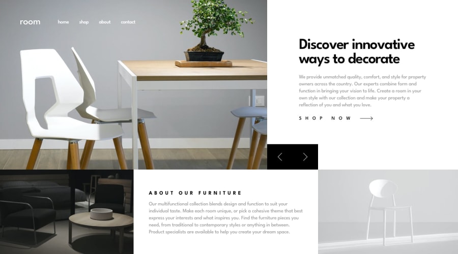
Design comparison
SolutionDesign
Solution retrospective
What are you most proud of, and what would you do differently next time?
I am happy to complete this project, as I didn't think this would give me a tough time..CSS is my strong suit but I certainly faced problem with some relative and absolute positioning. But it later turned out ok..
What challenges did you encounter, and how did you overcome them?The positioning of the arrows to change the pictures for the slideshow both on mobile and desktop views was troublesome. the overlay for the mobile screen also posed a little issue. i later had to ask chatgpt for help.(duhh).
What specific areas of your project would you like help with?The aspect of when to use fixed instead of absolute when trying to positon elements.
Community feedback
Please log in to post a comment
Log in with GitHubJoin our Discord community
Join thousands of Frontend Mentor community members taking the challenges, sharing resources, helping each other, and chatting about all things front-end!
Join our Discord
