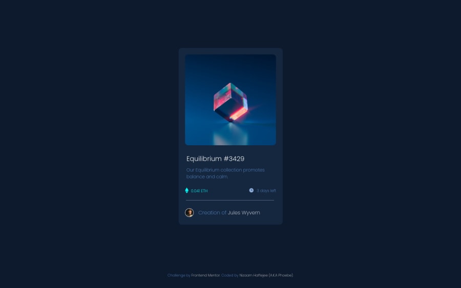
Design comparison
Community feedback
- @RioCantrePosted almost 3 years ago
Hello there! Nice work in completing this project. Viewing at your solution, I would suggest the following for you...
- Clean the whitespaces in the code
- Include
altwith description in theimgtags - Wrap the
containerwith specific tag likemainandattributionwithfootertag for readability. For HTML structures, refer it with this one Semantics - Ways to modify this part...
<div> <span class="seperator"></span> </div> into: <div class="seperator"> </div> or <hr>- Add more font weight in importing the font style. In this project, it have only 200, which would not make the main font bold.
- Add
cursor: pointer;in the.overlayFaderule set - Increase the font in
.item-datainto14px
Overall, you did well. Hope this help and Keep it going!
Marked as helpful1@Lord-NickelbottomsPosted almost 3 years ago@RioCantre Thanks for your feedback. The whitespace helps with making things readable for me as having everything all bunched up will make it look incredibly messy. You have no idea how much it means to me when someone provides helpful feedback like this to me so thank you again :)
1 - @PhoenixDev22Posted almost 3 years ago
Hello @Lord-Nickelbottoms,
I have some suggestions regarding your solution :
-
There should be two landmark components as children of the body element a
<main>(which will be the component) and a<footer>(which will be the attribution). -
Anything with a hover style in a design means it's interactive. you need to add an interactive element around the image and
Equilibrium #342andJules Wyvern. -
you need to add an interactive element around the image
src="images/image-equilibrium.jpg"( not the eye image as it's a decorative image). the eye image doesn't really need to be in the html, you could do it with css. -
Images must have
alttext. and it differs for informative or decorative image . -
For any decorative images, each
imgtag should have empty alt="" andaria-hidden="true"attributes to make all web assistive technologies such as screen reader ignore those images in (src="images/icon-clock.svg" src="images/icon-ethereum.svg" src="images/icon-view.svg") and for thesrc="images/image-avatar.png"and src="images/image-equilibrium.jpg"should more descriptive. -
No need for all this
  <div>
     <span class="seperator"></span>/* there is <hr> */
   </div>
You can use
border-topto the<div class="creator">.-
don't use span for meaningful content.
-
You can use an unordered list
<ul>forclass="item-data"and in each ``<li>```, there would be<img>and<p>(to wrap the text .) -
It's rarely ever a good practice to set heights on elements . let the content define the height.
-
Never use
pxfor font-size.
Hopefully this feedback helps.
1 -
Please log in to post a comment
Log in with GitHubJoin our Discord community
Join thousands of Frontend Mentor community members taking the challenges, sharing resources, helping each other, and chatting about all things front-end!
Join our Discord
