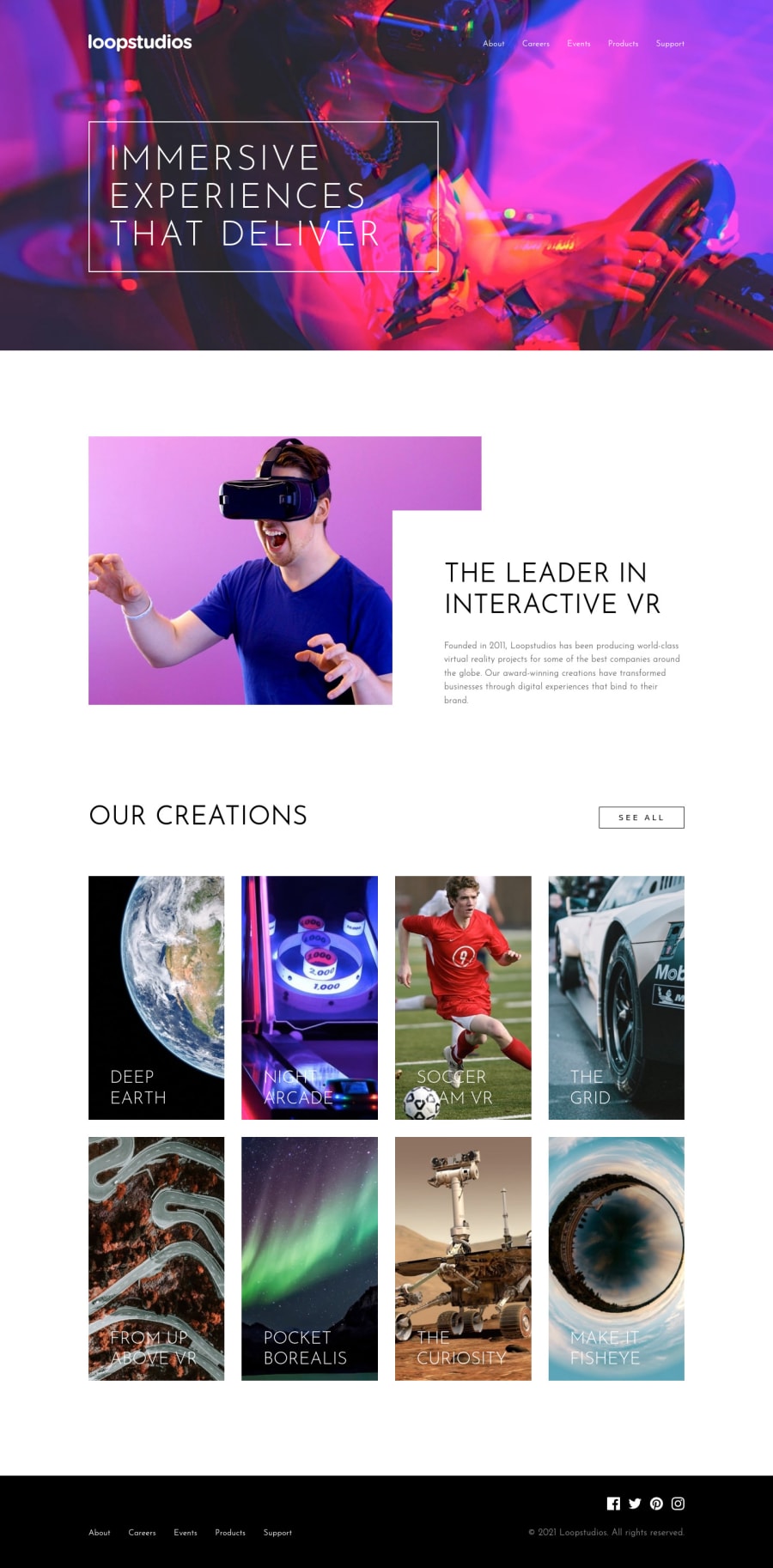
Design comparison
Solution retrospective
Hi guys, I learned quite a few new thing doing this one( see the repo for more). No qestions come to mind directly but as always I would love to hear any thoughts you wanna share.
Keep coding :).
Community feedback
- @UfukDulgerPosted over 3 years ago
looks perfect boss
1 - @ApplePieGiraffePosted over 3 years ago
Greetings, Mojtaba! 👋
Well done on this challenge! 👍 Your solution looks great and responds just about perfectly! 🙌 I like that you added some extra details such as the animation to the mobile menu and the "Read More" links in the cards in the "Creations" section! 😀 It's good to hear you learned a lot in completing this challenge, as well! 🎉
The only very tiny thing I noticed is that the favicon isn't loading for the page, for some reason (perhaps try double-checking the file path for the image). 😉
Keep coding (and happy coding, too)! 😁
1@MojtabaMosaviPosted over 3 years ago@ApplePieGiraffe @ApplePieGiraffe thank you, for this one I used github pages for hosting and for some strage reason all the image paths in the sass files didn't work so I modified the paths in the compiled css file. I make sure to fix the one too. Haven't seen any solutions from you recently, you must be working on something really big or learning other techonogies.
Keep coding :)
0 - @trafikiPosted over 3 years ago
Wonderful job, I'm curious, how did you achieve the opening section (the one with the vr guy)??
1@MojtabaMosaviPosted over 3 years ago@trafiki the mobile view for the section is quite simple but the desktop one is a bit more harder but nothing too complicated. Using the picture tag with two source elements and media attributes lets the browser choose the version of the image.On desktop view I used put a limited width and a position absolute on it. I recomand you read this article https://css-tricks.com/a-guide-to-the-responsive-images-syntax-in-html/, a much better explanation the mine, I hope it helps.
Keep coding :)
0 - @palgrammingPosted over 3 years ago
🌟🌟🌟🌟🌟 Looks really good. Nice job and I really like your hover state on the cards
1@MojtabaMosaviPosted over 3 years ago@palgramming thank you, I wanted to do something more flashy and pure decorative like an arrow but a button made with text made more sence.
0
Please log in to post a comment
Log in with GitHubJoin our Discord community
Join thousands of Frontend Mentor community members taking the challenges, sharing resources, helping each other, and chatting about all things front-end!
Join our Discord