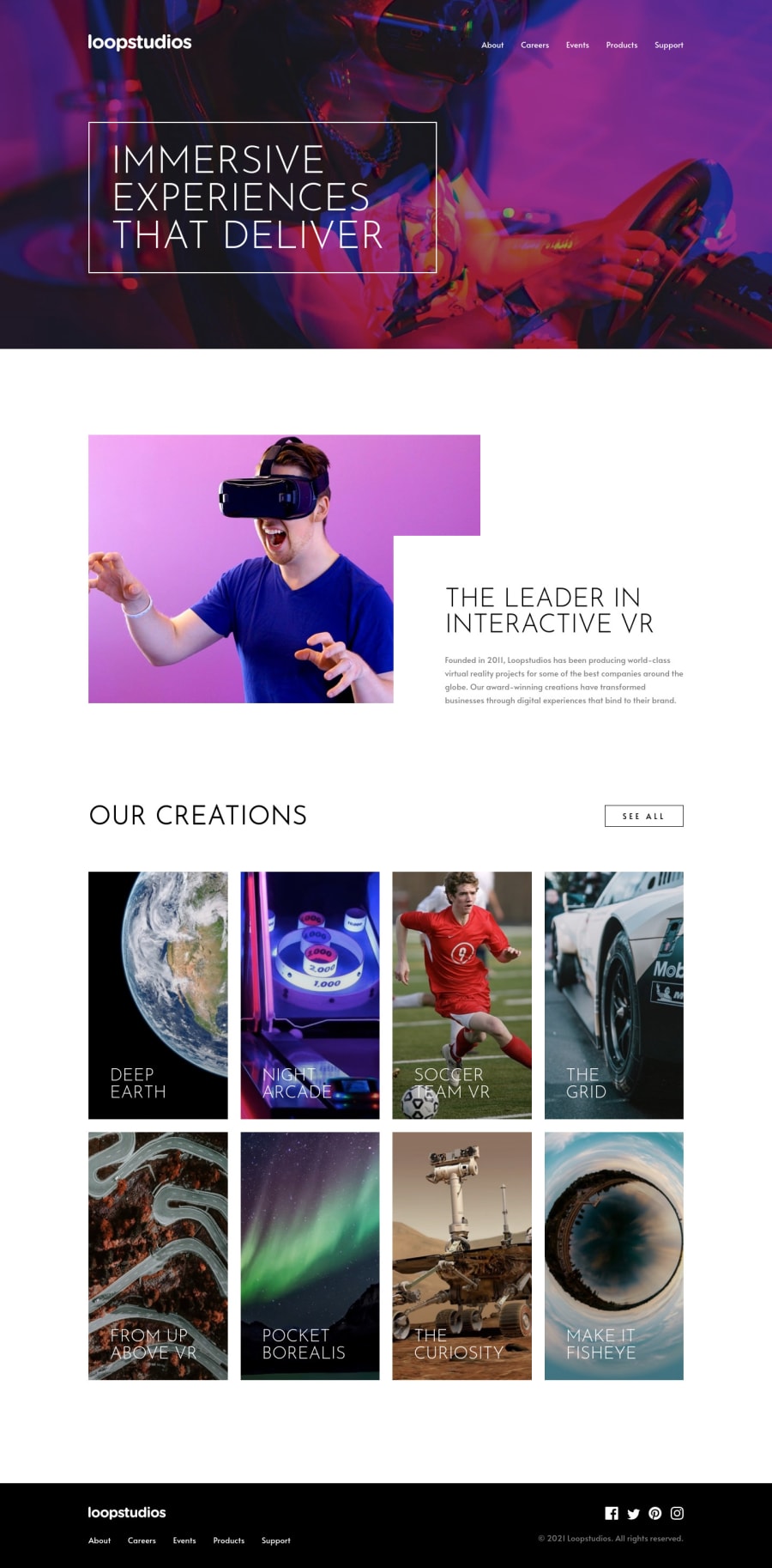
Design comparison
Community feedback
- @wendyhamelPosted over 2 years ago
A very sharp solution! Great job!
You got the gradient fades right and I like your transformations.
Did you see your report? These are things you can easily fix so you’ll have no accessibility or HTML issues.
I remember spending too much time on making this one meet my responsive standards.
You can improve the grid cards between the screen sizes 577px - 750px. The cards are in one column, but you use the portrait sized image. Which makes for very large cards on a relatively small screen.
Other than that, I have nothing to say.
Happy coding!
Marked as helpful0
Please log in to post a comment
Log in with GitHubJoin our Discord community
Join thousands of Frontend Mentor community members taking the challenges, sharing resources, helping each other, and chatting about all things front-end!
Join our Discord
