Design comparison
Solution retrospective
Feedbacks are appreciated. And need guidance in the dropdown menu part.
Community feedback
- @RayanthecoderPosted almost 4 years ago
it looks cool
1 - @janegcaPosted almost 4 years ago
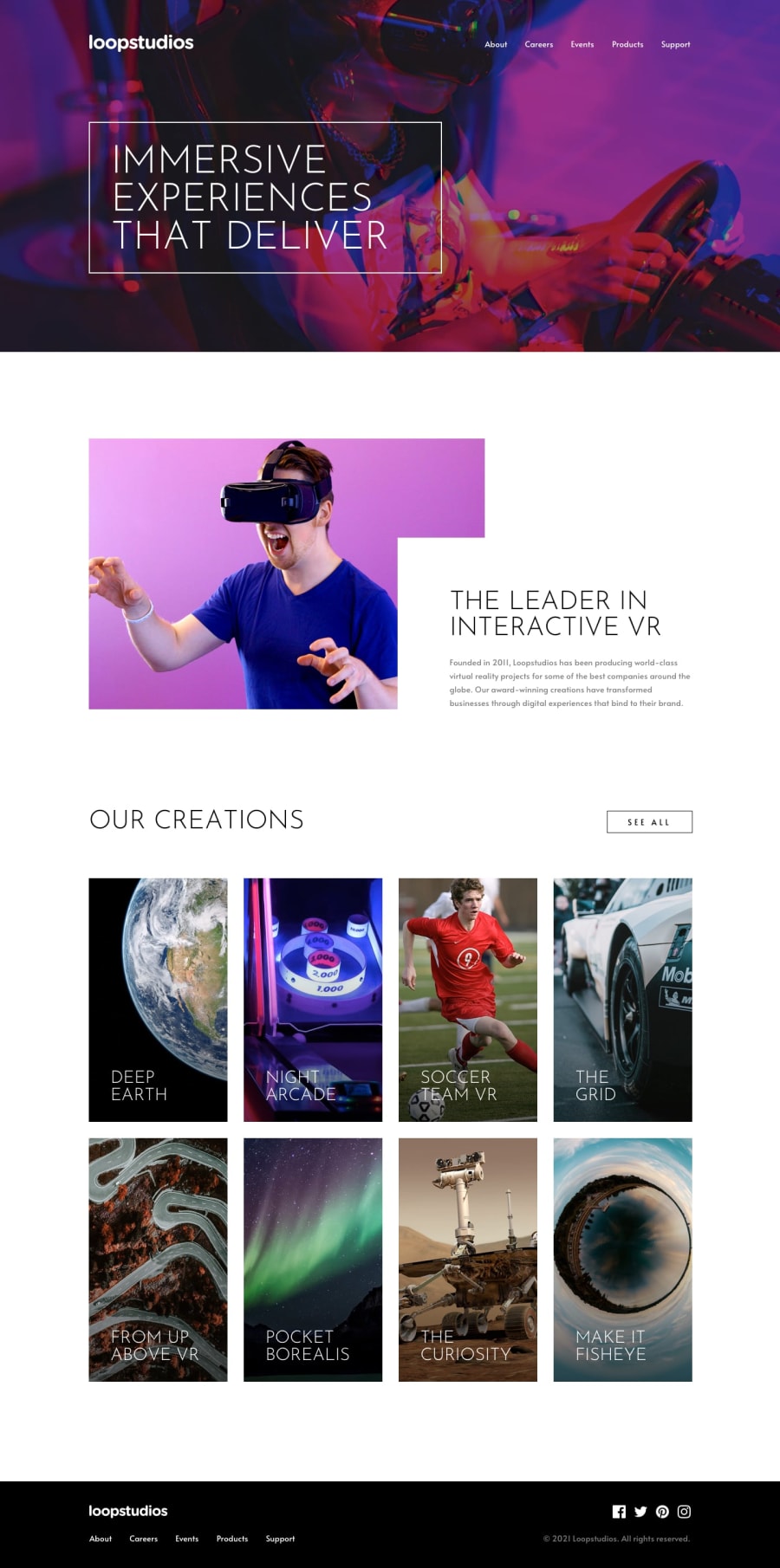
Hi Ritesh, your page is getting close to the design but is still missing some pieces
From the mobile design:
-
The hamburger menu should open a full screen overlay with the menu text uppercased, thin weight, and left-aligned
-
The gallery images should have a gradient overlay that changes on hover
-
The 'see all' button is missing the hover effect as are the footer menu and social icon links
-
The Twitter icon is missing from the social links
-
The copyright text is grey in the original design
From the desktop design:
- The menu items need some left-hand spacing
- The bottom part of the intro text is cut-off
- The text overlaying the graphic in the next section does not match the design layout
- The hover overly works on the gallery images but the text should be changed to black
- The hover on the footer menu is working but the underline is too wide, there is still no hover on the social icons
My apologies for not providing fixes for all these, at best, I would suggest you refactor things one at time and possibly restructure your code for mobile first (Kevin Powells' videos helped me better understand the approach, see Responsive Design Made Easy). For the hamburger menu with the overlay try DevEd's Animated Responsive Navbar Tutorial for some insight into how it can work.
Hope this is of some help.
0 -
Please log in to post a comment
Log in with GitHubJoin our Discord community
Join thousands of Frontend Mentor community members taking the challenges, sharing resources, helping each other, and chatting about all things front-end!
Join our Discord
