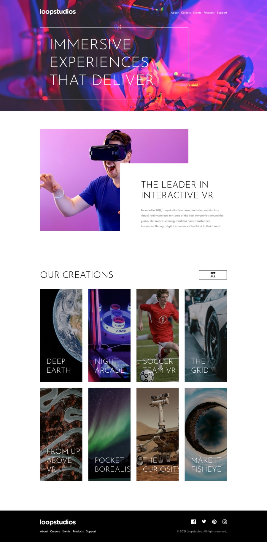
Design comparison
Solution retrospective
I try my best. If anybody have suggestions how to make it better I would appreciate it. Thanks.
Community feedback
- @benjoquilarioPosted over 3 years ago
Hi, Jugo-JS
Congratulation on finishing this one, It looks good and response very well, I know this challenge is challenging but I know you will improve day by day.
-
I only saw is the
scriptis not connecting properly on thedocumentthat's why the hamburger menu is not opening. -
I suggest to make the text on mobile small because I think It's too big in mobile.
great job keep coding!
Marked as helpful0@benjoquilarioPosted over 3 years ago@Jugo-JS the closing hamburger menu not closing.
0@Jugo-JSPosted over 3 years ago@benjoquilario Aaah sorry. Did not save the files properly. Now it should work :) Thank you for your time.
0 -
- @aUnicornDevPosted over 3 years ago
Looks good on desktop as well as mobile...
Just around 1200px to the mobile breakpoint.. things are a little squeezed and start overlapping/overflowing. You can look into that area..
Marked as helpful0
Please log in to post a comment
Log in with GitHubJoin our Discord community
Join thousands of Frontend Mentor community members taking the challenges, sharing resources, helping each other, and chatting about all things front-end!
Join our Discord
