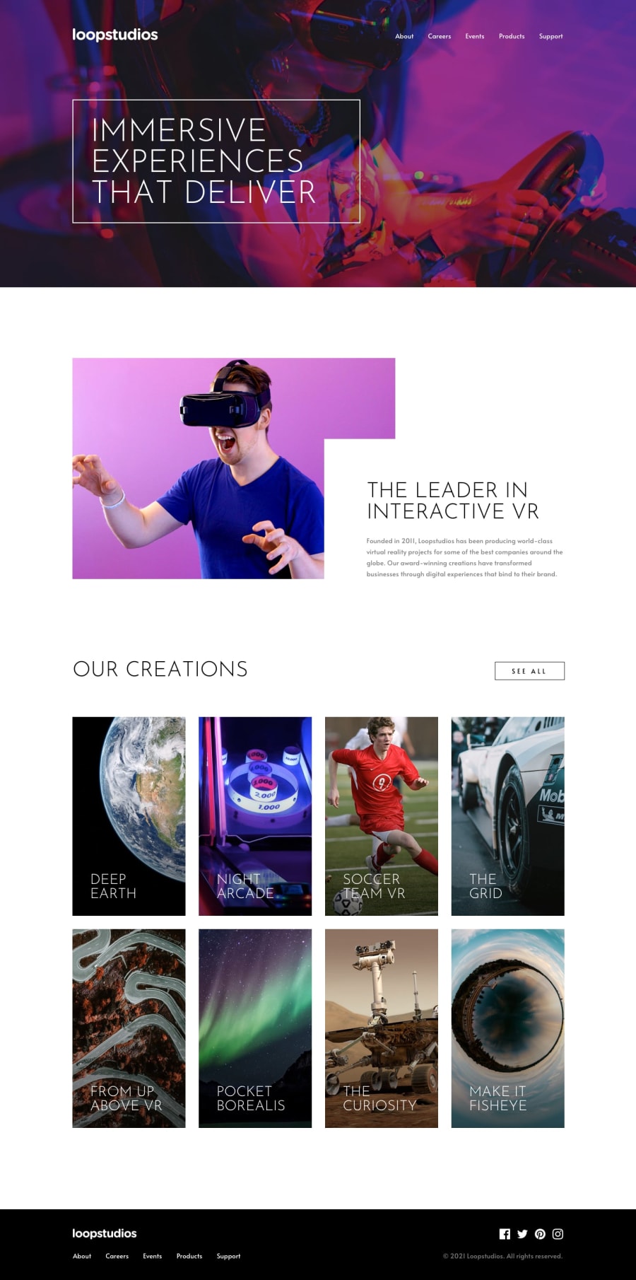
Loop-studios-landing-page
Design comparison
Solution retrospective
Hello frontendMentors, I am back with a new solution. What do you think about it, check it out. The solution can also be viewed on larger screens and also smaller screens.
Please dont forget to like and comment :)
Community feedback
- @mycrochipPosted over 2 years ago
Congratulations Kamasah on completing the challenge. You've put forward a wonderful solution.
I however noticed that most of the images in the reference had dark linear gradients applied over them to increase the contrast of the layered texts and enhance readability. One could also use mix-blend-mode on the hero image.
Good job overall.
Marked as helpful0@Kamasah-DicksonPosted over 2 years ago@mycrochip oh okay I will implement that on my next project and also on the hero section background Thanks👍
1 - @muyiwa99Posted over 2 years ago
Hi,
Great design; lots of details were matched to the original design and also picked up some useful tips from your code .
Maybe just move the white text container to the left a bit more, you give the container an absolute position, the use the Left property to move the container left.
1@Kamasah-DicksonPosted over 2 years ago@muyiwa99 It is a pleasure receiving your comment will update it soon.
Have a happy coding experience👍
0
Please log in to post a comment
Log in with GitHubJoin our Discord community
Join thousands of Frontend Mentor community members taking the challenges, sharing resources, helping each other, and chatting about all things front-end!
Join our Discord
