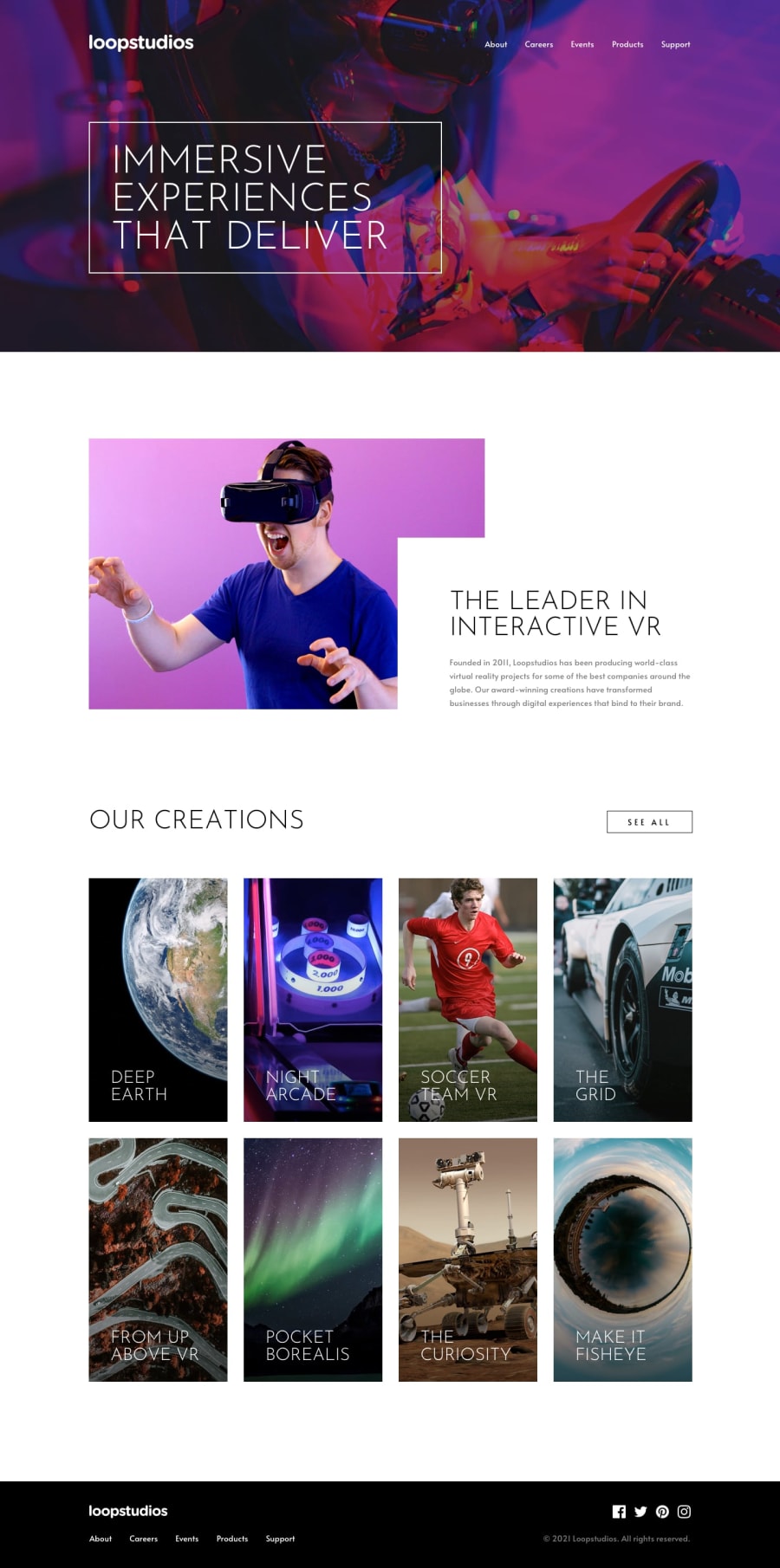
Design comparison
Solution retrospective
i find the process of designing the site so fun and interesting
Community feedback
- @wendyhamelPosted 10 days ago
Hi, nice to see you try this challenge.
I noticed a few points you could improve.
Match to the design
- In the design the hero image has a subtile darker overlay
- The fonts in your project are not a match to the design in some places: header menu and the body text)
- The colors in your project are not a match to the design in some places: (active indicator line under the header navigation, body text)
- The padding and margin is different from the design: (mostly padding and margin around the sections)
Semantic HTML
- I do not see a
<main>tag - I noticed a lot of
<div>'s. There are many more semantic html elements you can use. Try the use of<section>or<article>elements. You can read about it on MDN for example.
Responsive You did a good job here for the mobile layout. But you might want to tweek some in-between states and the larger screens. There is some content overlapping (body text overlaps the button) or cramped together (header logo and menu) on some in-between sizes. If you look at your project on a larger screen, the site kind of falls apart because there is a lot of space between. (the body text stretches out a lot, the button gets very far away to the right from the grid that stays on the left) You could contain the width the content is allowed to take and center it, to make it all look good on a greater veriety of screen sizes.
I hope this will help you.
Happy coding!
0
Please log in to post a comment
Log in with GitHubJoin our Discord community
Join thousands of Frontend Mentor community members taking the challenges, sharing resources, helping each other, and chatting about all things front-end!
Join our Discord
