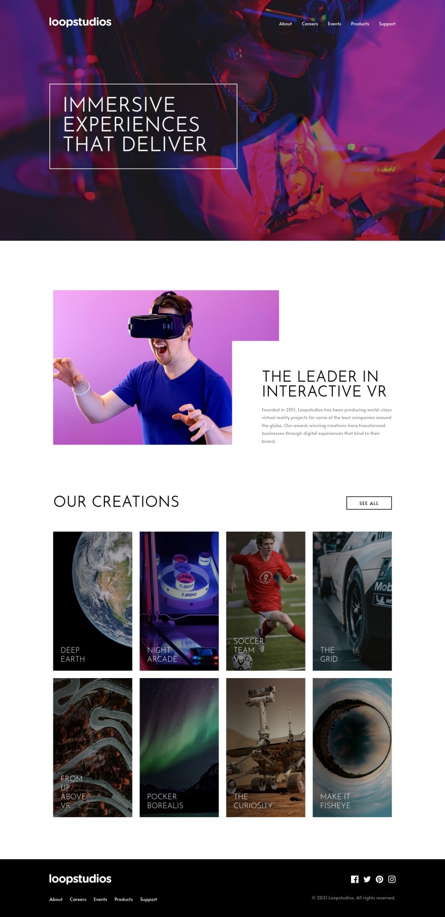
Design comparison
Solution retrospective
Hey guys,
This was a trickier challenge than it looked like. Much trickier, actually. I know it's not a pixel perfect copy of the design but that even intentional in some places ^^ Please feel free to roast me, I'm sure I made some errors!
Have a great day!
edit: I couldn't figure out what's up with the fonts! They just look different than shown on the design. Any idea why?
Community feedback
- Account deleted
Not sure about anything font related, but your solution looks good on desktop.
- Give your solution a
maximum width of 1440px
to prevent it from stretching and becoming too wide on large screens. - On
our creations
I think it would have been better to go from 4 rows to 3 rows, because when you reach the first breakpoint and it switches to 2 rows it has a lot of empty space on the sides and it doesn't look good. - When you switch to desktop while the mobile menu is still active it gets carried over and does not get dismissed.
Keep coding👍.
Marked as helpful0@FluffyKasPosted over 3 years ago@thulanigamtee I was wondering about the rows myself whether it looks strange but then I have my answer :D. I'll change it soon and fix the mobile menu too! Thanks for taking the time to look at it ^^
0 - Give your solution a
- @sreehariv-codePosted about 1 year ago
I have a doubt. How are you switching the images in the cards in Our Creations section while switching between media queries ?
0@FluffyKasPosted about 1 year ago@sreehariv-code Hey, if you inspect the HTML you can see I switch images using a <picture> element.
1 - @MarlonPassos-gitPosted over 3 years ago
Hi, very nice at your job. I really liked the animation of the button on the hamburger menu, the transition between the elements was very smooth, nice. Now what I think could improve is:
- On your h1 to position the element instead of using the margin I would use the following:
.header-title { display: flex; justify-content: flex-start; align-items: center; }
in my view it's not better to use gid or flex to position something instead of the margin itself. Then in each @media you would improve with flex to align instead of changing the margin
-
In the footer you could have placed the navigation items inside a <nav> tag like you did in the header
-
social-media items could be inside a <ul> instead of the <div>
-
I think that the footer breaks to a column very early, for me it should only stay that way when it reaches the size of a cell phone, in the tablet version I would place each of the content blocks one above the other, see https://prnt. sc/1tchs14. I've made some grotty changes to try and show how cool I think it would look in the tablet version, see https://prnt.sc/1tci55v
-
I particularly liked this "smoke" effect that you added to the photos, who knows if when the person hovers over it, this is a lightening in the photo, it would be really cool
0
Please log in to post a comment
Log in with GitHubJoin our Discord community
Join thousands of Frontend Mentor community members taking the challenges, sharing resources, helping each other, and chatting about all things front-end!
Join our Discord