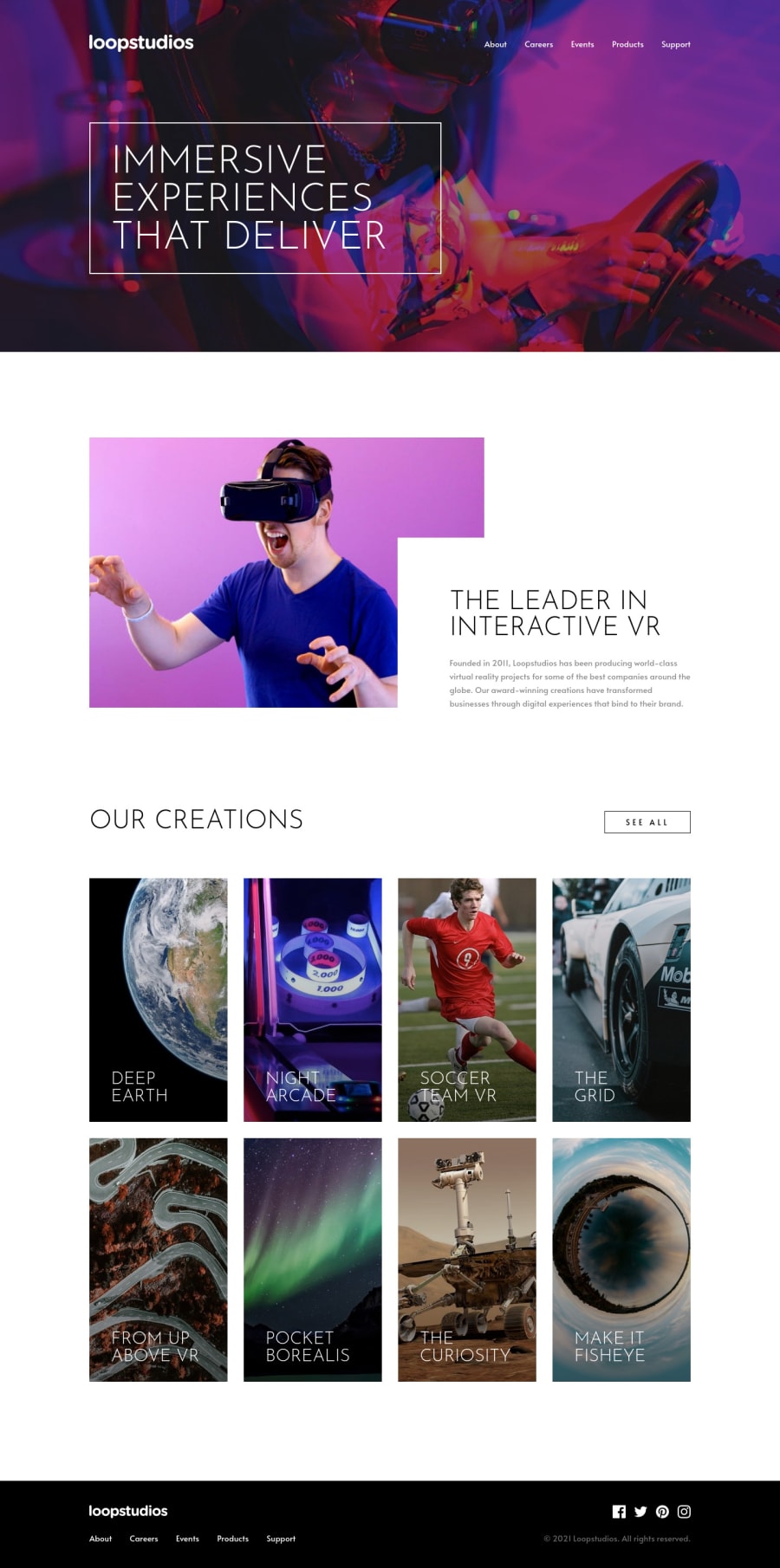
Loopstudios - SCSS. Grid, Flexbox, JS, CSS animated mobile menu


Design comparison

Solution retrospective
Hi, everyone! 👋 I really enjoyed this one, probably because I like the design so much. Finally getting more comfortable with grid, and might even be starting to prefer it over flexbox!
The Sass architecture is probably a bit overkill for a project this size, but I wanted to practice something more akin to 7-1 architecture. I also didn't implement mix-ins to this project, but plan on doing so in the next.
Also, this solution uses 62.5% font-size. I’m aware of the issues with it and will try out other methods in future projects. 👍
I really tried to stick to just 750px and 1200px for my main media queries. I was very tempted to add a third to switch a little earlier to the vertically-styled cards and the horizontal overlap style for the “interactive VR” section, since neither work at 750px. Ultimately, I figured it was a bit too much. Thoughts?
I added a subtle image zoom on hover to the “Our Creations” cards using ::before pseudo elements. Is there a better and/or simpler way to go about this?
I’m trying to implement better accessibility practices, so for this project I made sure to put the mobile menu button inside the nav and also added the aria-expanded attribute. Is this the correct way to go about this? Any suggestions on accessibility and how to improve it are very welcome!
Any and all feedback is greatly appreciated! Thanks for taking the time to look at my solution. 😄
Community feedback
Please log in to post a comment
Log in with GitHub
Join our Discord community
Join thousands of Frontend Mentor community members taking the challenges, sharing resources, helping each other, and chatting about all things front-end!
Join our Discord