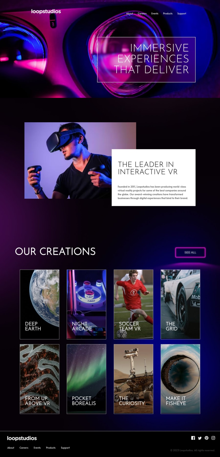
Design comparison
Solution retrospective
Hey, Frontend community 👋
In this project, I've crafted a visually stunning solution that addresses a specific challenge while incorporating a redesign, semantic HTML5, mobile adaptation, and hover styles.
Your feedback and suggestions are greatly appreciated, as they will contribute to my growth as a frontend developer. Thank you for taking the time to examine my project!
Community feedback
- @alex931dPosted over 1 year ago
greattings... i must say i love your redesign and great layout but i still found so minor mistakes nothing major :)
- your cards should be an article instead since when google index your page it will know you are making an article in your case cards
- using <section></section> for the first section please use class name like hero-section to tell other developers that this is the first thing the users will see
- needs more animations. example when hover over your cards i notices an small brigtness effect it could use a little transition fade out or in
- when you are write lists like your nav menu please use
overall great design love it alot :)
0@Magic1vyPosted over 1 year ago@alex931d Hello! Thank you for your feedback and kind words about my redesign. I'm glad you liked it. I would like to address your points.
1.Regarding using
<article>instead of<div>for the cards, you're right that using<article>could be more semantically correct. However, in this case, using<div class="card">is an acceptable solution, as its main purpose is to group and style elements on the page, which aligns with the purpose of the<div>tag. I will take this into consideration to improve the semantics of my code.2.As for the first
<section>and its class, the current first section already has a semantic<section>tag and a meaningful class name of section-interactive. Despite this, I will consider your suggestion to use the class name hero-section to make it clearer for other developers.3.In terms of animations, it's a matter of individual developer choice, and I believe the current hover effect is consistent with the project's design.
4.Finally, about using
<ul>and<li>for the navigation menu list, both ways of writing are acceptable and can be used depending on the developer's preference. Link about<nav>Thank you for your time and feedback! I appreciate your help in improving my project.
0
Please log in to post a comment
Log in with GitHubJoin our Discord community
Join thousands of Frontend Mentor community members taking the challenges, sharing resources, helping each other, and chatting about all things front-end!
Join our Discord
