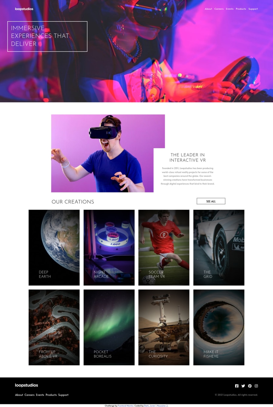
Loopstudios landing page with html Sass vanilla js & Parcel
Design comparison
Solution retrospective
hey guys, after a break learning more Js, Sass , bundlers .. i took this challenge and im waiting your feedbacks. Thank you
Community feedback
- @ApplePieGiraffePosted over 3 years ago
Hey there, Dark-Lover! 👋
I just noticed you submitted another solution (it's been a while since your last one)! 😀 I came to check it out and say nice effort on this challenge! 👍 I like how you made the header navigation sticky! 👏
I'd like to suggest,
- Turning the social media icons in the footer of the page into links by wrapping each of them in an anchor tag.
- Adding
object-fit: coverto the images in the "Our Creations" section to make sure that they are clipped (instead of stretched or squeezed) when the size of their container changes. - Perhaps making the text in the hero and introduction sections of the page a little bigger (to match the original design), since they seem a bit small, at the moment. 😉
As always, keep coding (and happy coding, too)! 😁
1@Dark-LoverPosted over 3 years agohey dear @ApplePieGiraffe i didnt pay attention to the object-fit, i will change it. i was focusing on using sass and parcel bundler for the first time, and also getting familiar with npm commands. thank your for ur constructive feedbacks ;)
0 - @kamzozoPosted over 3 years ago
hey I am doing this challange and I am having trouble with my footer. I have created my footer but they is still white space after the foooter any help. Love the animation you added to the boxes, keep up the good work.
0@Dark-LoverPosted over 3 years ago@kamzozo hey, i would like to help you but i cant figure out the problem, if u have the code in a repo post it here.
0
Please log in to post a comment
Log in with GitHubJoin our Discord community
Join thousands of Frontend Mentor community members taking the challenges, sharing resources, helping each other, and chatting about all things front-end!
Join our Discord
