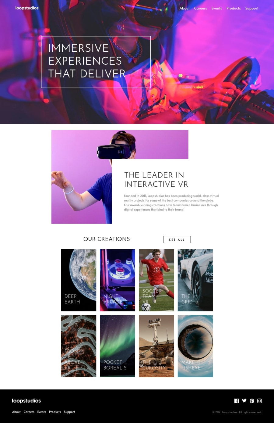
Loopstudios landing page using SCSS and webpack [GRID + FLEX]
Design comparison
Solution retrospective
Would love to get any input on the mid-section with the tricky overlay. I tried several "hacks" such as background-image, flex with relative positioning and some other solution, but I ended up just going with the position absolute.
Community feedback
- @shashreesamuelPosted over 2 years ago
Hey Aadv1k good job completing this y. Keep up the good work
Your solution looks great however in comparison however I have some suggestions
-
in comparison with the design the header section of your website is a bit misaligned.
-
The section with the cars that states "The leaders in VR" needs some margin from the top. You can achieve this using the
margin-topproperty. -
The section with the creations needs some margin from the top in addition the imagesi itself needs to be scaled up a little bit. You can achieve this using
transform: scale() -
Your footer social icons just needs some margin from the right using the
margin-rightproperty.
In terms of your accessibility issues simply wrap all your content between
<main>tags to get rid of all the issuesIn terms of your accessibility issues, this article should help below
https://www.geeksforgeeks.org/minification-of-css-files/
I hope it helps
Cheers Happy coding 👍
Marked as helpful1 -
- @Aadv1kPosted over 2 years ago
Alright WOW there are a lot of accessibility issues with this one! don't know why it is marking minified css generated by the sass compiler as a "error", the sass compiler would have told at compile time.
0
Please log in to post a comment
Log in with GitHubJoin our Discord community
Join thousands of Frontend Mentor community members taking the challenges, sharing resources, helping each other, and chatting about all things front-end!
Join our Discord
