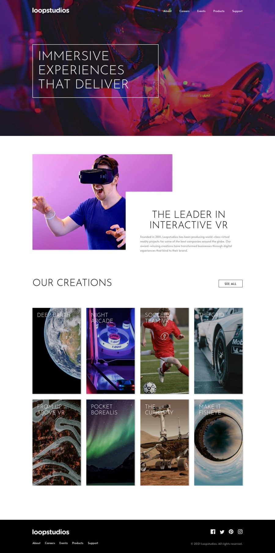
Loopstudios landing page using Sass, Flexbox, and Responsive Images
Design comparison
Solution retrospective
I gave this challenge my best shot, and I'm mostly satisfied with my results but there are plenty of things I would do differently. I'd love to hear some input and critique that I can use on my next challenge!
One thing I learned a lot on this challenge is using pseudo elements for background-images so I could use css filters without blending the contents on top of the background. I used tons of flexbox and some css grid to lay everything out as well. I'm sure how I did the mobile menu is not the best, but I think the overall product looks alright to me.
Cheers and happy coding!
Community feedback
- @janegcaPosted almost 4 years ago
Hi Michael, this one did have quite a lot to tackle, overall your page looks pretty good and responsive. Two small nits, the hover for the menu items is only a 1/2 line on the menu items and also, in the original design, the titles for the images is located at the bottom rather than the top of the image.
I don't regularly use SASS features but noticed the there is a lot of repetitive code in your CSS for loading the images, would a mixin work there? so you would only need to put in the url?
Nice job overall. Happy coding.
1@mikeronewmanPosted almost 4 years ago@janegca Thanks for the response! I noticed the image titles as soon as I submitted my solution. I didnt notice the hover underline width though, good eye. The repetitive background image code was extremely frustrating, so I think a mixin would be a great idea for that. Thanks for the input, cheers!
0
Please log in to post a comment
Log in with GitHubJoin our Discord community
Join thousands of Frontend Mentor community members taking the challenges, sharing resources, helping each other, and chatting about all things front-end!
Join our Discord
