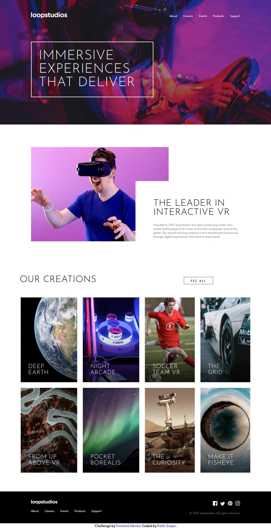
Loopstudios Landing Page using HTML, CSS and JavaScript
Design comparison
Community feedback
- @KapteynUniversePosted 5 months ago
Hey Katie, nice job. I liked the nav animation. Couple suggestions:
Giving active states a little transition would be better too, like
.primary-btn,
nav ul li::after {
transition: 0.5s;
}
Also to the creations items.
Since they have a active state on the design, i believe they will redirect user to the corresponding page, so instead of using div product card, i think you can use anchor tag.
Because absolute positioning, between 993px-1200px screen size "See All" button going on top of the about section. The way i did it, i put "Our Creations" and "See All" inside the grid with the pictures and adjust their column and row on desktop layout.
I think you don't need 2 source media in the picture tags for this challenge. Like this way img will be mobile img until 577px.
<picture>
 <source media="(min-width: 577px)" srcset="./assets/images/desktop/image-deep-earth.jpg">
 <img src="./assets/images/mobile/image-deep-earth.jpg" alt="">
</picture>
Also use a modern css reset for every project
0
Please log in to post a comment
Log in with GitHubJoin our Discord community
Join thousands of Frontend Mentor community members taking the challenges, sharing resources, helping each other, and chatting about all things front-end!
Join our Discord
