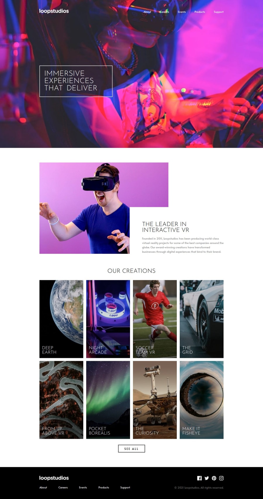
LOOPSTUDIOS LANDING PAGE USING HTML AND SCSS


Design comparison

Solution retrospective
I am proud that I am getting better at SCSS. It is easier to avoid repitition using mixins, extend, etc.
What challenges did you encounter, and how did you overcome them?I got too focused on the styling that I somehow got lost with the JS. Not being able to follow what class to call was wracking.
What specific areas of your project would you like help with?I would greatly appreciate if someone could help me identiy where to use JS to add the interactivity. I did not know how to place the items in the header in order to get the desired effect.
Community feedback
- @ricardoychinoPosted 6 months ago
Hi,
Congratulations! That's a great looking solution. Very readable and good semantics, too!
There are two things that caught my attention that I'd like to point out:
-
At hero section, I think it would be better if you just use
backgroundproperty to apply the image instead of using a<picture>withposition: absolute;. It is easier to handle an image change or if the image doesn't have the dimensions that fits the section. As for the responsive source of the images, you can always use a media query. -
Initially I was intending to recommend the selector
:nth-child()for the section where you have the products, instead of using selectors.product-{n}, but actually I don't think you need to set the grid properties from lines 374 to 391 and 425 to 440 in yourmain.scss. I disabled those properties on devtools and your design is still looking great! The only one that I kept is thegrid-template-columns: repeat(4, 1fr);for desktop viewing. Why did I point this out? Because, let's assume you need to add another product eventually. You will then probably need to add a.product-9rule to your CSS, or use one of the currently created.product-{n}on it. Either way, there are disadvantages: maintainability or consistency, respectively. If you remove those styling, the style will still be as you intended and there's no need to worry in case you need to add or remove new items
About the JS interactivity:
It seems like it's pretty much halfway done and that only needs to add a JS interaction. With your current code, I'd start adding a event listener to the button which adds (or in your current code's case, remove) a class to handle visibility of the menu, such as:
/*
  This adds a reference to the target elements
  (This is optional, but I personally believe that this
  makes the code a bit cleaner)
*/
const buttonElement = document.getElementById('menu')
const navElement = document.querySelector('.header-nav')

/* Adds the event listener for clicks to the <button> */
buttonElement.addEventListener('click', () => {
  // Check if nav is hidden
  if (navElement.classList.contains('hidden')) {
    navElement.classList.remove('hidden') // Shows nav
    buttonElement.querySelector(':scope .open').classList.add('hidden')  // Hide the hamburger icon
    buttonElement.querySelector(':scope .close').classList.remove('hidden') // Shows the close icon
  } else {
    navElement.classList.add('hidden')  // Hides nav
    buttonElement.querySelector(':scope .open').classList.remove('hidden')  // Shows the hamburger icon
    buttonElement.querySelector(':scope .close').classList.add('hidden') // Hide the close icon
  }
})
This is enough to toggle the show/hide in your current code and continue to style further or change the structure if you want to. You will see that the styling will need some adjusts after applying that toggling. I'd change a little this approach, but the way you did works fine as well.
I hope this is what you needed and that it helps. I apologize if it didn't. Again, great job and keep it up!
Marked as helpful0@1deadjoePosted 6 months agoThank you @ricardoychino for the invaluable feedback. I will revise my code with your suggestions and see how it works.
1@ricardoychinoPosted 6 months ago@1deadjoe You're welcome! Glad to help.
I suggested these improvements, but your code is pretty good already! Reach me out if you need some additional help
0 -
- @1deadjoePosted 7 months ago
Thank you. Sadly it is the one thing I could not do perfectly. I got too focused on the styling.
0 - @imandreansPosted 7 months ago
Your solution is already similar to the design, while there are difference like layout and size. You can come back and improve it later.
The solution is responsive, sadly there's no sidebar that appear when I click the menu button.
Your code is well-written both SCSS and HTML. I like that you use picture tag to add the images.
0


Please log in to post a comment
Log in with GitHub
Join our Discord community
Join thousands of Frontend Mentor community members taking the challenges, sharing resources, helping each other, and chatting about all things front-end!
Join our Discord