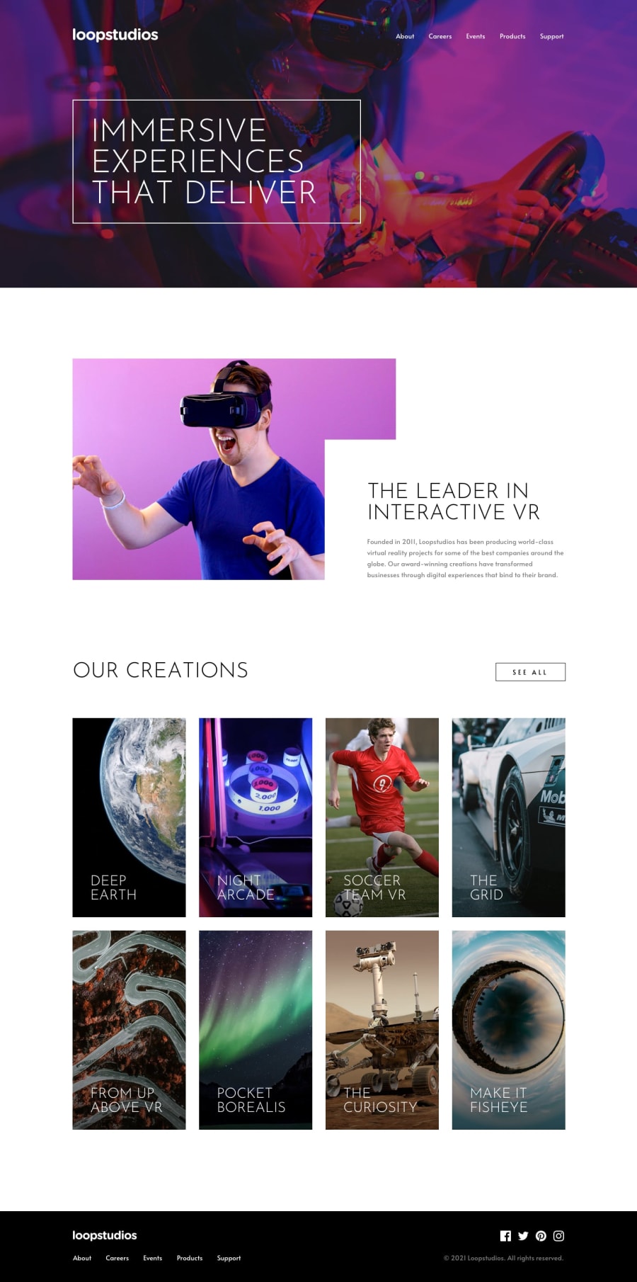
Loopstudios Landing Page using Astro, Sass and CUBE CSS
Design comparison
Solution retrospective
I'm most proud of how I integrated accessibility into the hamburger menu and achieved a responsive design across various components. Using Sass and CUBE CSS for styling allowed me to create a modular and maintainable codebase, especially as I built responsive grids in both the about and products sections. Next time, I’d like to experiment with a CSS framework like Tailwind to streamline some of the utility classes and explore more efficient ways to achieve responsive layouts.
What challenges did you encounter, and how did you overcome them?One of the primary challenges was designing an accessible hamburger menu that worked smoothly across devices. I focused on making it accessible by implementing keyboard navigation and ensuring screen readers could interact with it easily. The responsive grid layout for the products section was also challenging, particularly in making it adapt well between mobile and desktop. For this, I utilized CSS Grid and media queries in combination to ensure it displayed optimally on different screen sizes.
What specific areas of your project would you like help with?I would like feedback on the HTML structure, especially regarding semantic use, and on the accessibility features I implemented. Additionally, any insights into optimizing CSS for responsive layouts or suggestions on how to further refine my Sass and CUBE CSS code for maintainability would be valuable.
Community feedback
- @E-C-ShackelfordPosted 2 months ago
I want to acknowledge that I don't have experience with Astro, but as I explored your file structure and code, I found your organization to be clear. Separating concerns into folders like pages, layouts, components, styles, vendors, and subfolders and files improves your project's readability and maintainability.
You have prioritized accessibility and user experience with keyboard-triggered focus states and ARIA attributes, and your consistent use of clear, descriptive variable and class names quickly communicates each class and variable's purpose.
Your Product section's 'See All' button seems too small, which might affect some users' visibility and usability on mobile devices. I would experiment with different padding and font sizes–increasing these sizes could help mobile users tap the 'See All' button more easily.
Perhaps add some comments to your code to ensure greater clarity, both for future developers and for yourself.
Your file structure is solid, and your code is maintainable, accessible, and demonstrates strong attention to detail. You've done some great work in your solution to this challenge. I wish you the best of luck as you continue your coding journey!
Marked as helpful0@kaamiikPosted 2 months agoThank you, Elizabeth, for your feedback. I really appreciate it. @E-C-Shackelford
Astro is excellent for creating various components, and it’s very user-friendly with strong documentation. Additionally, I’m using Kevin Powell template for organizing files and folders, which you can find on his GitHub by searching astro-sass-template . I made some personal modifications to suit my preferences and the specific challenge requirements.
For the link button you are true completely. Actually I felt It but also I tried It becomes like the design :-) I should make it a little bigger.
0
Please log in to post a comment
Log in with GitHubJoin our Discord community
Join thousands of Frontend Mentor community members taking the challenges, sharing resources, helping each other, and chatting about all things front-end!
Join our Discord
