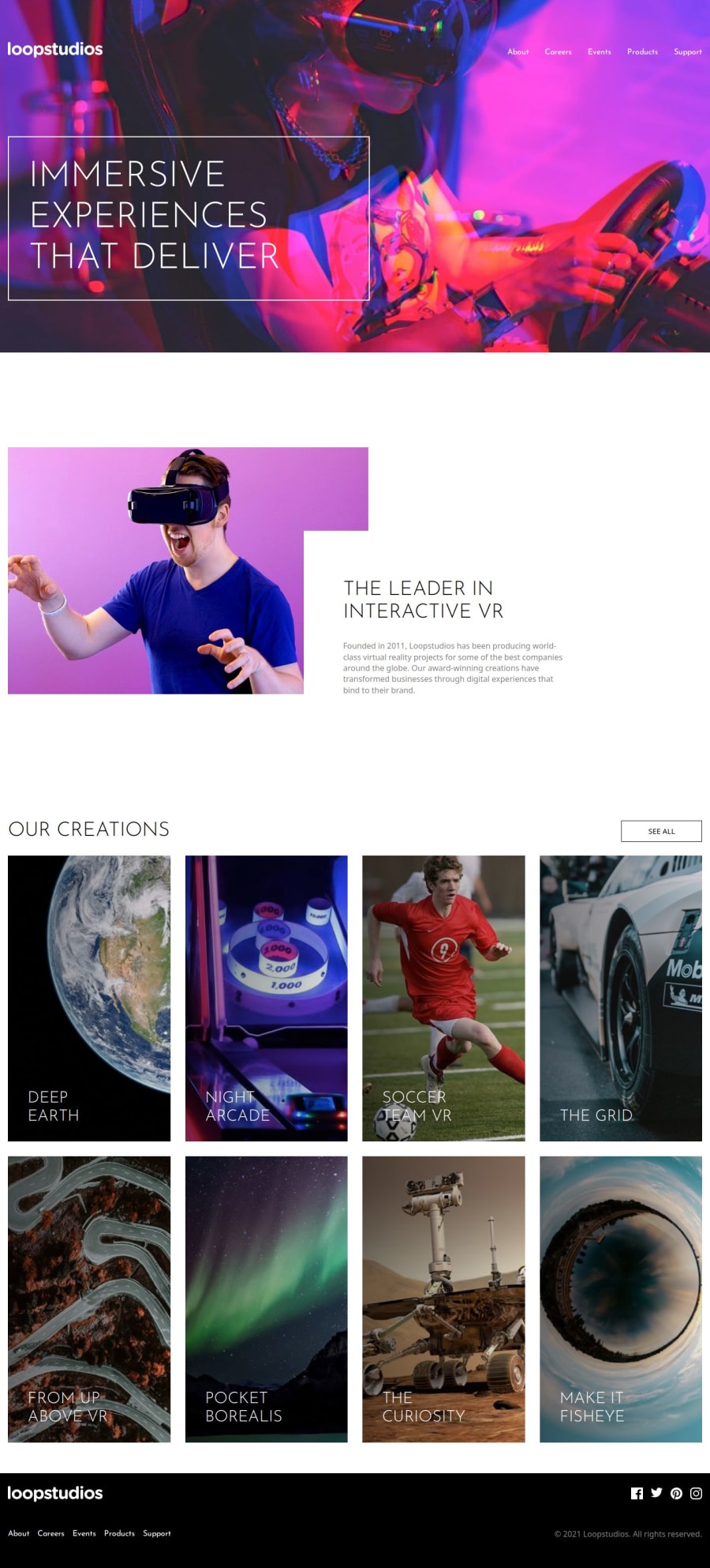
Loopstudios-landing-page
Design comparison
Solution retrospective
I enjoyed starting the project without using a starter and I'm proud to produce the desktop version.
Next time I will plan responsive layout. It required an effort that I didn't imagine, especially the railing. I believe that the lack of planning and proper organization left the css a little confusing.
What challenges did you encounter, and how did you overcome them?I rarely use the grid display, I have an addiction to using flex displays. That was the biggest challenge, changing the way of thinking.
What specific areas of your project would you like help with?CSS organization and verbosity for responsive version. Responsive fonts to suit other screen scenarios.
I feel like I could give you a better solution
Please log in to post a comment
Log in with GitHubCommunity feedback
- @hansaldev
you had made a great layout, congratulations for you work but I have question, why did you make all styles in one file?
Join our Discord community
Join thousands of Frontend Mentor community members taking the challenges, sharing resources, helping each other, and chatting about all things front-end!
Join our Discord
