Design comparison
Solution retrospective
I would love any feedback!
Community feedback
- @AgataLiberskaPosted over 3 years ago
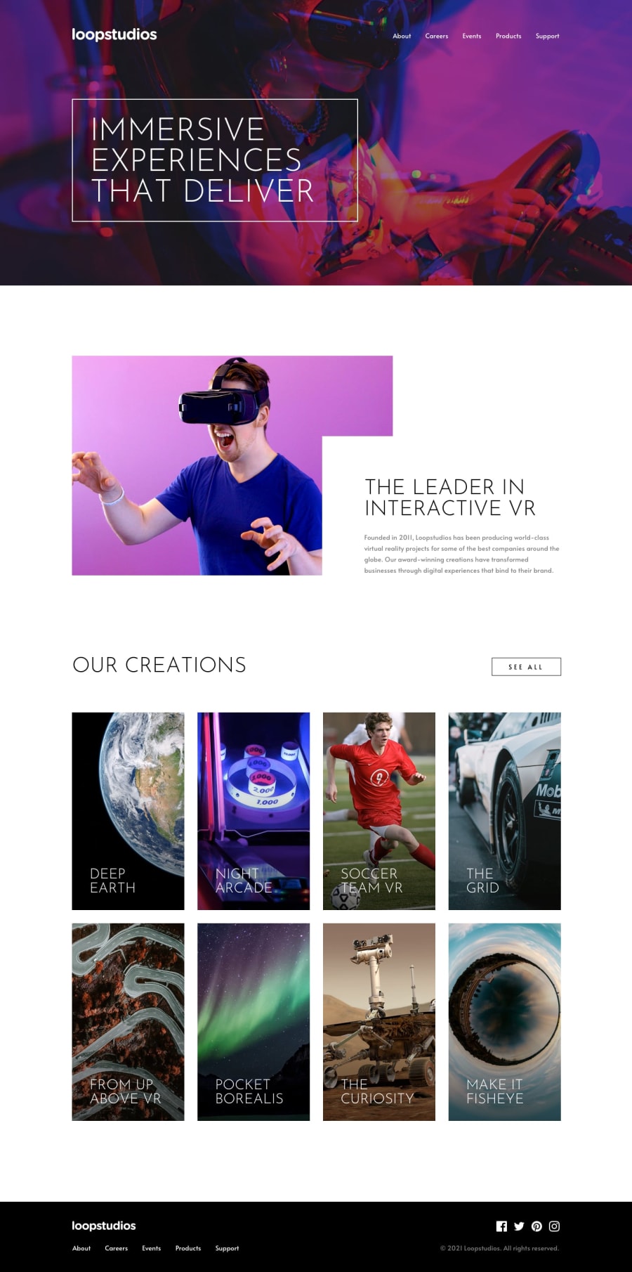
Hi @luismadf! Well done on this challenge, it looks great! It's beautifully responsive, I only noticed one thing: if I set the display size to iPad Pro, the h3 on one of the items overflows the container. Removing the set width on that makes it wrap nicely :)
It would be great if you added some animation or transition to your hover states and the mobile menu.
I also had a look at the report - the accessibility issues are caused by the fact that you're using an image inside an anchor tag, so there is nothing for screen readers to read out. You can add
aria-label="Facebook"etc. to the anchor tag to fix that issue.Also, thinking about UX here: I know you've got a nav in the header and in the footer, but you've also got 'See all' that looks like a button or a link, it looks interactive, but it's just a div and could never take me anywhere (it's also not accessible since it's not focusable). The same for the block images - they're advertising something and they change on hover which means I should be able to click them and be taken somewhere else. I realise this is just a one-page project, so there's nowhere to go exactly, but it's something I would keep in mind in the future :)
Hope this helps :)
0
Please log in to post a comment
Log in with GitHubJoin our Discord community
Join thousands of Frontend Mentor community members taking the challenges, sharing resources, helping each other, and chatting about all things front-end!
Join our Discord
