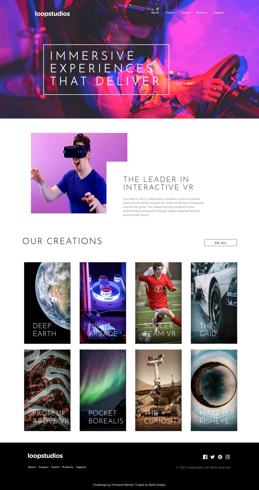
Design comparison
SolutionDesign
Community feedback
- @rohitdubey1352Posted almost 2 years ago
@grace-snow please review my solution and give me some suggestions. Thanks
0@grace-snowPosted almost 2 years ago@rohitdubey1352 I'm afraid this looks really broken on mobile. You need to test down to phones at 320px wide like devtools emulation for iPhone 5 or SE. Remember to check landscape as well as portrait
I expect most problems are caused by heights (possibly in viewport units) instead of min-heights but I'm away from my computer so can't inspect
In the html
- headings must be correctly ordered. Only one h1 per page
- never EVER Change button labels for assistive tech users. You will have broken the button and made it inoperable to many by doing that
- if an image is valuable it needs a proper description of how it looks, if decorative then leave alt blank
- the cards can't all have headings if they've no content
- footer needs a nav element them both navs on the page need accessibly labelling
- social links need to say where they go not social 123 etc.
- social links should be in a list
- don't use brs.
Marked as helpful0@rohitdubey1352Posted almost 2 years ago@grace-snow Sure, I will see what can I do. Thanks for your suggestion.
0
Please log in to post a comment
Log in with GitHubJoin our Discord community
Join thousands of Frontend Mentor community members taking the challenges, sharing resources, helping each other, and chatting about all things front-end!
Join our Discord
