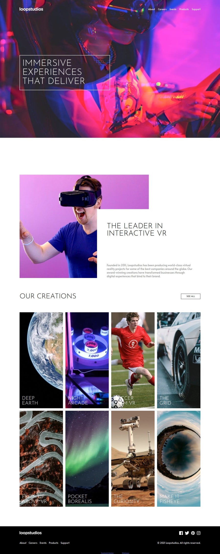
Design comparison
SolutionDesign
Solution retrospective
What are you most proud of, and what would you do differently next time?
This is my first multi-page website. I started the challenge desktop-first which turned out to be quite hectic. I will definitely begin my challenges mobile-first from now on.
What challenges did you encounter, and how did you overcome them?- Getting the curtain navigation menu right was a bit confusing but a page on w3schools helped.
- Adjusting the font size to the different screen sizes was also a challenge. I used the "clamp" method which helped but I think it could be better. Any tips?
I would appreciate any feedback to improve my first attempt at a multi-page website.
Community feedback
- @cartaplassaPosted 5 months ago
<br>tag usage is discouraged (Reason), you could use
or other options, but personally I love putting in places where NOT to break lines.- For adjusting font-size there's an option of setting it relative to viewport (
vh/vwunits), or better yet look into CSS Container Queries - Styling the
.create-photosgrid must have been painful, but grid is actually a lot easier to deal with. I made a PR with some changes, take a look. - What was the purpose of this structure:
<a href="#home">A<span>bou</span>t</a>
There are different text colors in footer's original design, the abyss between header and notes in
infosection could be several times shorter, other than that lgtm, good job0
Please log in to post a comment
Log in with GitHubJoin our Discord community
Join thousands of Frontend Mentor community members taking the challenges, sharing resources, helping each other, and chatting about all things front-end!
Join our Discord
