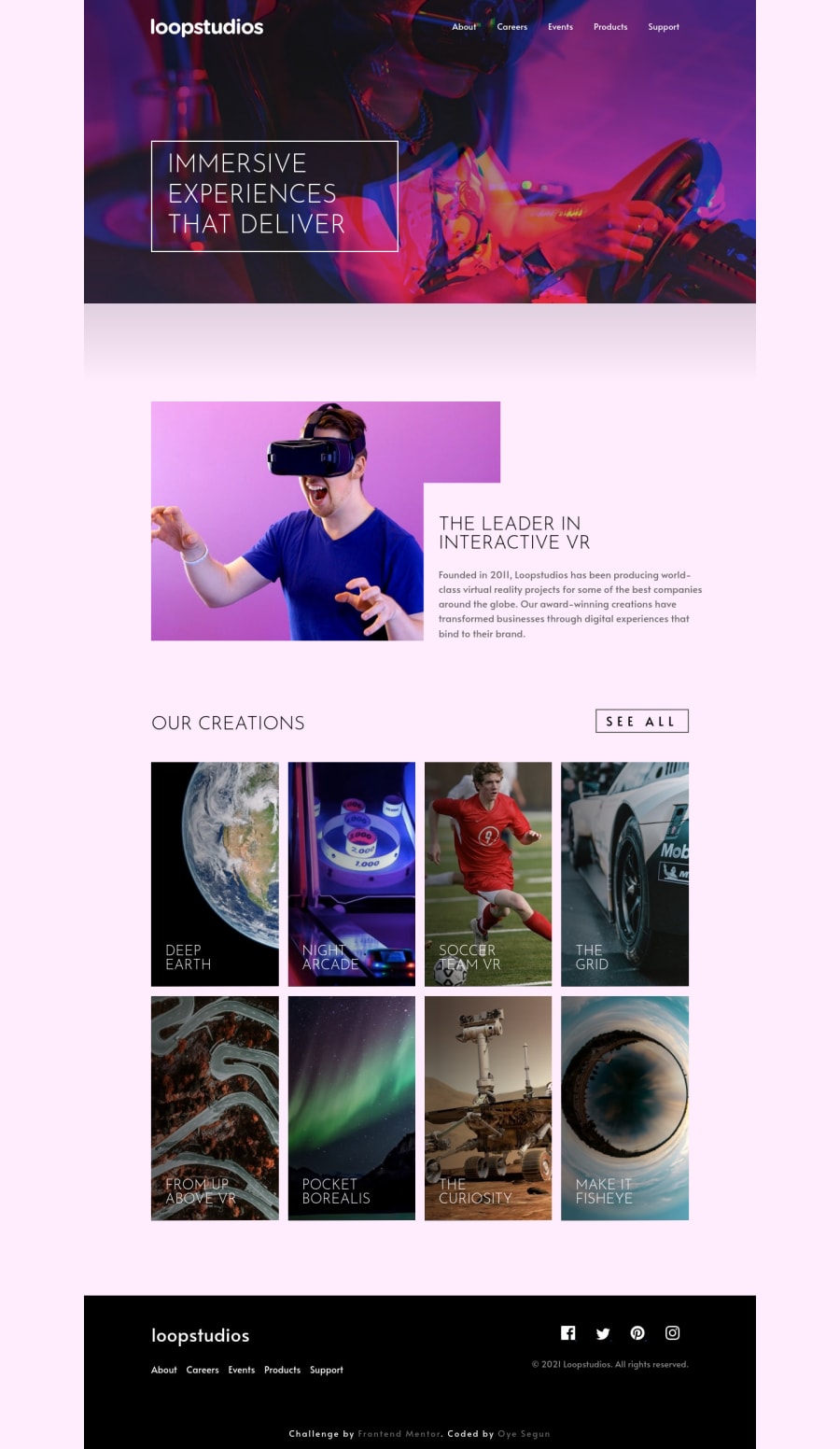
loopstudios landing page built with vanilla css and js
Design comparison
Solution retrospective
Making the header background-image responsive was quite challenging. I later discovered the image itself has a max width of 1440px, so it's never going to scale beyond this width. Had to set the page width to a max-width of 1440px(90rem) to keep things in order. What do you think guys?
Community feedback
- @Virus936Posted over 3 years ago
How did you manage the see all button to be below the creation box content in mobile-view and on top in the desktop-view ? you did a great job btw ;)
0@SamsegunPosted over 3 years ago@Virus936 Hello vira, i did that by giving the "our creations" section a position of relative and the see all button a position of absolute. For the desktop view - right:0; top: 3% i think(depends on the way you want it). For mobile view - bottom:0; left:50%. Hope this helps!
0
Please log in to post a comment
Log in with GitHubJoin our Discord community
Join thousands of Frontend Mentor community members taking the challenges, sharing resources, helping each other, and chatting about all things front-end!
Join our Discord
