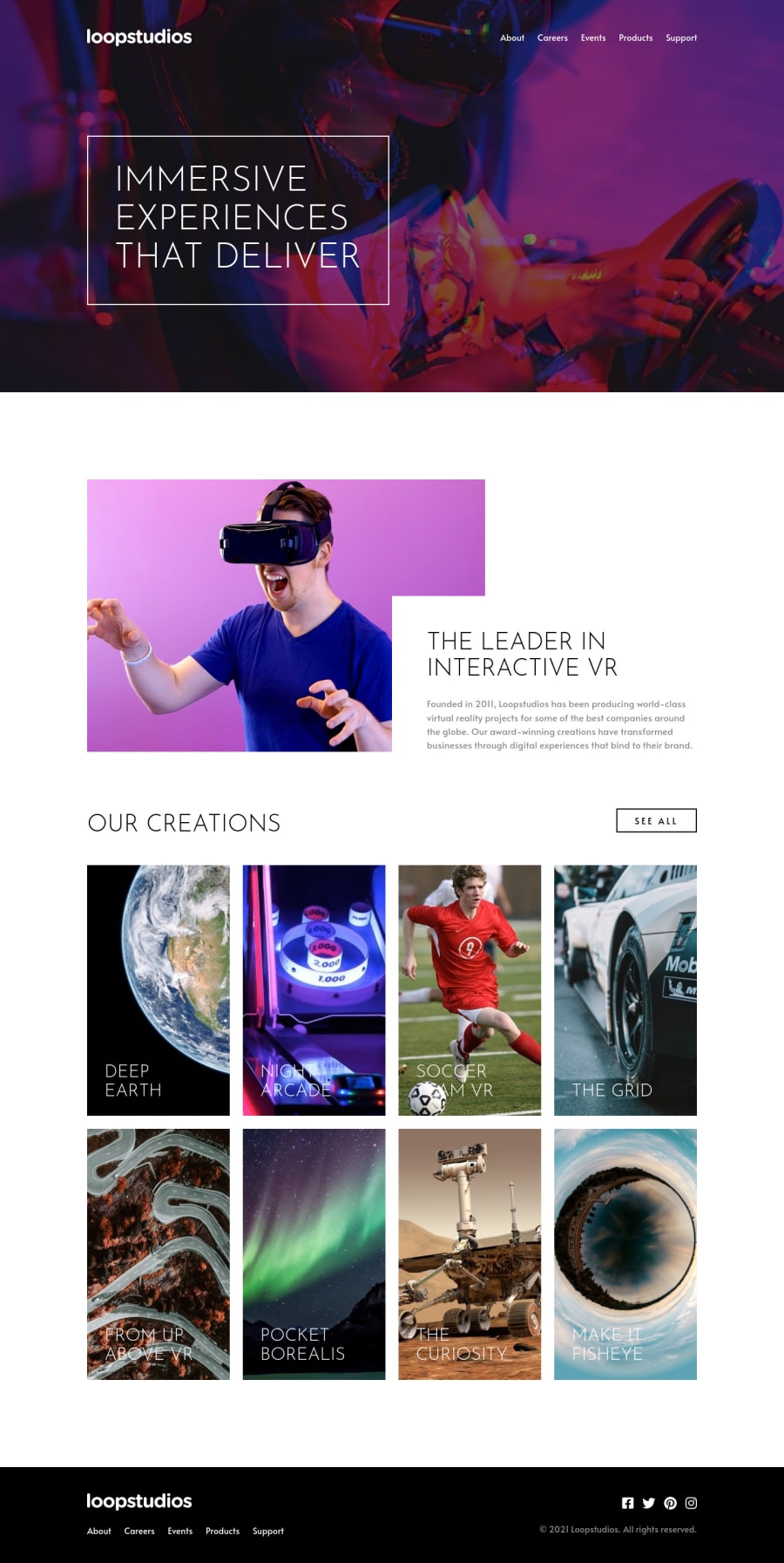
Design comparison
SolutionDesign
Solution retrospective
Hey guys! I completed another amazing project from Junior Challenges. I learned a lot from this project.
- I develop this site using mobile first approach.
- I applied both Mostly Fluid and Layout Shifter Responsive Pattern.
- I used clamp function to make fluid typography.
Things that I need to practice more are:
- Making more responsive navigation bar as possible.
- Organize CSS
- Accessibilty
- Responsive patterns
Please let me know if you guys have any suggestions for my improvement. Thanks in advance and much appreciate it.
Happy coding guys! 😊
Community feedback
Please log in to post a comment
Log in with GitHubJoin our Discord community
Join thousands of Frontend Mentor community members taking the challenges, sharing resources, helping each other, and chatting about all things front-end!
Join our Discord
