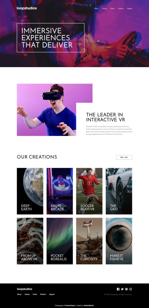
LOOPSTUDIOS LANDING PAGE π― [ ACCESSIBLE - BEM - VANILLA CSS3 ]
Design comparison
Solution retrospective
πΎ Hello, Frontend Mentor Community,
This is my solution for the Loopstudios Landing Page.
- Scored
98.6%
on Google Pagespeed Insights! π€© - Comes with Custom navbar w/ scroll-in & scroll-out animation π₯
- Accessible hamburger menu w/ ES6 π
- Actually i delayed to post this solution, this was completed about 5 months ago βͺ
- Minified the
css
files to improve site performance π - Used
Prettier
code formatter to ensure unified code format βοΈ - Layout was built responsive via mobile first workflow approach π²
- Had a lots of fun while building this challenge ! π€
- Feel free to leave any feedback and help me to improve my solution π‘
.
π¨βπ¬ Follow me in my journey to finish all junior challenges to explore solutions with custom features and tweaks
Ill be happy to hear any feedback and advice !
Community feedback
- @MelvinAguilarPosted about 1 year ago
Hello there! π The solution you provided five months ago for this challenge looks great! π However, I have a few suggestions to address some potential drawbacks in terms of accessibility:
-
Firstly, let's talk about the "main__creations" section:
The elements in that section have a hover effect, making them seem like interactive elements such as buttons or links. Since you're showcasing a list of "creations", and users might expect to navigate to these "creations" by clicking on them, it might be more accessible to implement actual links (
<a>
) instead of using<div>
.Now, here are the drawbacks of using
<div>
instead of a link:- Users who rely on keyboard navigation can't easily move through the "creations" using the
Tab
key. - There is no pointer cursor in your solution.
- Users might expect some action to occur when they click on the items.
For a more elegant solution, you might want to consider implementing some of the techniques shared on this page: Cards - Inclusive Components π.
- Users who rely on keyboard navigation can't easily move through the "creations" using the
-
Consider adding a "Skip to main content" link to your solution:
This helps users bypass header links and directly access the main content, improving the experience for those using screen readers or keyboard navigation.
You can follow a guide on how to create a "Skip to content" link by visiting the following link: How to Create a "Skip to Content" Link | CSS Tricks π..
-
Media Queries and Horizontal Scrollbar:
Lastly, a horizontal scrollbar appears between 56em (896px) and 1024px due to a single media query and the "OUR CREATIONS" section. You could either add more media queries or use the RAM (Repeat, Auto, Minmax) technique in CSS to avoid the need for multiple media queries.
You can learn more about the RAM technique here: Repeat, Auto, Minmax | Web.devπ..
These suggestions are aimed at enhancing your project's accessibility. Keep up the fantastic work! If you have any questions or need further assistance, feel free to ask. π
Marked as helpful1@0xabdulkhaliqPosted about 1 year ago@MelvinAguilar Thank you for providing detailed insights for my solution.
For now i have made changes for accessibility on creations section. I think we don't want to add explicit roles for
ul
&li
likerole="list"
,role="listitem"
. Is it okay ?I have not used
RAM
in my entire css journey so in future i can give it a try, the resource you shared is absolutely valuable!Thank you.
1@MelvinAguilarPosted about 1 year ago@0xAbdulKhalid
We should consider using explicit roles like
role="list"
androle="listitem"
because some screen readers, specifically VoiceOver in Safari on macOS and iOS, tend to remove list element semantics when"list-style: none"
is applied in CSS. Without these roles, users won't hear that the content is a list or receive information about the number of items.Note: Website checkers might consider it unnecessary, but it's essential for accessibility.
For more information, you can refer to the following sources:
2 -
- @pra-23845Posted about 1 year ago
can you just tell me how did you make that animated sticky navigation bar i know how to make sticky navbar but not with animation i really like that one and i want to use it
1@0xabdulkhaliqPosted about 1 year ago@pra-23845 Yeah it's my pleasure to explain that feature to you!
Let's take a look on code first,
window.onscroll = function() { const header = document.querySelector("header"); if (document.body.scrollTop > 20 || document.documentElement.scrollTop > 20) { header.classList.add('header--active') } else { header.classList.remove('header--active') } };
Here's the breakdown,
-
It selects the
<header>
element in the HTML document usingdocument.querySelector("header")
and assigns it to theheader
variable. -
It attaches an
onscroll
event handler to thewindow
. This event handler is triggered whenever the user scrolls on the webpage. -
Inside the event handler, it checks the vertical scroll position of the page using
document.body.scrollTop
anddocument.documentElement.scrollTop
. If the scroll position is greater than 20 pixels from the top of the page, it adds the CSS class "header--active" to the<header>
element usingheader.classList.add('header--active')
. Otherwise, if the scroll position is less than or equal to 20 pixels, it removes the "header--active" class usingheader.classList.remove('header--active')
. -
In short, this code makes the header element change its appearance (e.g., background color or style) when the user scrolls down the page, and reverts to its original appearance when the user scrolls back up to the top. This is often used to create a "sticky" header effect or to reveal additional navigation options as the user scrolls.
Let me know if any doubts you may have regarding this feature.
1@pra-23845Posted about 1 year agoi cant tell you how much happy i am right now i just learn a new thing
thank you i really like your coding @0xAbdulKhalid
0 -
- @Saad-HishamPosted about 1 year ago
Welcome back, bro ππ
1@0xabdulkhaliqPosted about 1 year ago@Saad-Hisham I'm happy to hear you warm welcome Bro! π€ β€οΈ
And by the by, Assalamu alaikum warahmatullahi wabarakatuh Brother π«
1
Please log in to post a comment
Log in with GitHubJoin our Discord community
Join thousands of Frontend Mentor community members taking the challenges, sharing resources, helping each other, and chatting about all things front-end!
Join our Discord